Create a Data Report
- Create a title page, a table of contents to precede the body of the data report. Remember to list the information sources you used as the last page of the data report.
- To create the body of a data report, start by finding a document that has lots of tables but no charts:
Here's an example full of tables that you can use:
Targeted Summary of Minnesota Water Quality Assessment Report 2016 - Study the document for key points that are buried in columns and rows of table data.
- For the points you find, decide which of these chart formats works best:
- Format a key point as a pie chart:
- Open Google Chrome.
- Click
 and then Sheets.
 - Click Blank spreadsheeet.
- Move to column B row 3, and create a spreadsheet that looks something like this:

- Select the spreadsheet data you have just entered—all of it.
- Click Insert>Chart>Pie chart:
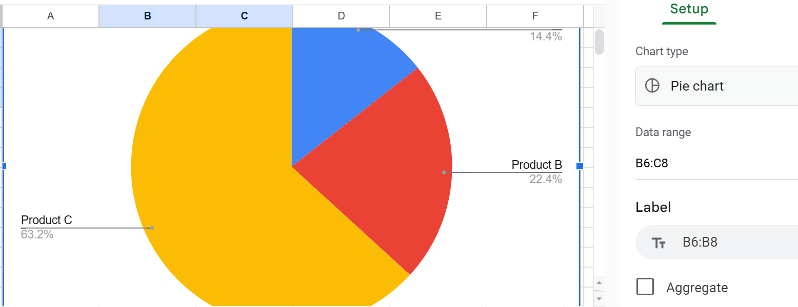
- Click into the area to the right of the pie chart to explore how you can customize the look of this pie chart.
- To use this pie chart in a document, click anywhere in the pie chart area, then click Edit>Copy.
- Paste your pie chart into the document.
- Format a key point as a bar or column chart
- Once again, open Google Chrome.
- Click and then Sheets.
- Click Blank spreadsheeet.
- Move to column B row 3, and create a spreadsheet that looks something like this:

- Select the spreadsheet data you have just entered—all of it.
- If you have just created a pie chart, Google Sheets will happily create and display another one for you. Just select and press Delete.
- Click the down arrow next to Pie chart, and look at the bar chart options you have:
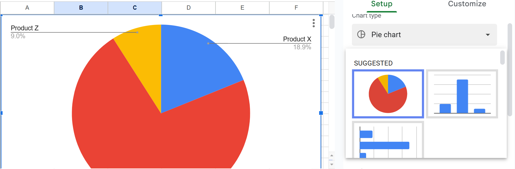
- Click either the column chart or the bar to the right of the spreadsheet:

- To use this column chart in a document, click anywhere in the column chart area, then click Edit>Copy.
- Paste your column chart into the document.
- Format a key point as a line chart
- Once more, open Google Chrome.
- Click and then Sheets.
- Click Blank spreadsheeet.
- Move to column B row 3, and create a spreadsheet that looks something like this:

- If you have just created a pie chart, Google Sheets will happily create and display another one for you. Just select and press Delete.
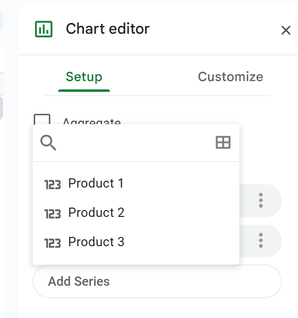
- Click the down arrow next to Pie chart, and look for the line chart option, which as multiple graph lines in it:

- If your line chart lacks one or more graph lines, click Setup:
- Click Add series and select the missing item:
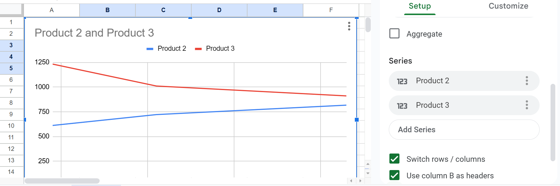
- To edit the title of, for example, the line chart, click Customize > Chart > axis titles, and enter a title under Title text:

- To add a y-axis label, click Vertical axis title and type the in the Title text blank.
pie chart
line charts (graphs)
complex formats (not covered here)
To create a simple pie chart in Google Sheets:
A bar chart (horizontal bars) or column chart (vertical bars) shows the relationship of items to each other to enable direct comparison. For example, imagine a bar chart showing domestic sales of U.S. cars next to domestic sales of Asian cars.
To create a bar chart in Google Sheets:
Google calls them "line charts," which brings the name in line with the other charts, but others call them "graphs."
To create a simple line graph in Google Sheets:
Add Chart Titles and Axis Labels
Maybe your line chart resembles this:

Add Explanatory Cross-References
For each of the charts in your data report, add an explanatory cross-reference, which looks something like this:
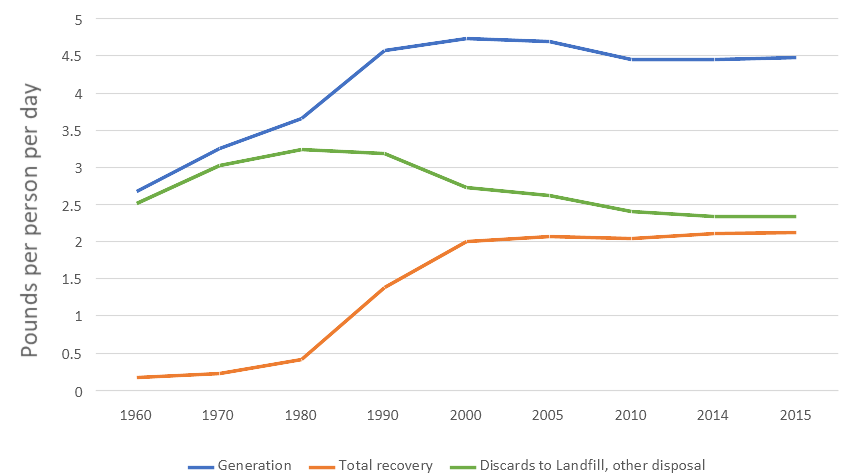
As you can see in the figure above, progress in recovery of municipal solid waste (MSW) was increasing until year 2000 but has stalled since then.
Information and programs provided by admin@mcmassociates.io.