Highlighting, as the term is used here, is the use of typographical effects to call attention to text. These effects can include italics, bold, all-caps, quotation marks, color, and so on. Highlighting calls readers' attention—or "cues" them"—to actions they must take or to information they must consider carefully.
One of the problems in technical writing—in particular, technical writing about computers—involves the use of the various techniques for emphasis. Unfortunately, some technical texts go overboard on the use of the various emphasis techniques which are discussed here.
Highlighting Fundamentals
Consider a few fundamental principles of emphasis:
- Practically any special textual effect that is different from regular body text can function as an emphasis technique. Things like italics, bold, underscores, caps, different size type, alternate fonts, color, the various graphical ingenuities (showing, reverse color, outline fonts) can act as emphasis techniques.
- Used in excess, any emphasis technique or combination of emphasis techniques can lose their ability to emphasize and become busy and distracting. Used in excess, any emphasis technique or combination of emphasis techniques can cause readers to be reluctant to read a text, if not avoid it altogether. Notice how unreadable the overly highlighted version of the notice is in this popup; also notice that it does not use the notice type recommended in notices.
- When extended text must be emphasized, use the special-notice format (rather than creating all-bold or all-caps paragraphs, for example).
- A carefully planned functional relationship must exist between the text that is emphasized and the emphasis technique that is used.
- Emphasis techniques must be used consistently to prevent readers from becoming confused.
- To promote consistency, you must use a style guide or style sheet, which records and then dictates all of your decisions about how you are going to use emphasis techniques.
- To help your readers understand your highlighting scheme, you can include a brief section somewhere in your document (usually in the preface) explaining how you're going to be using the emphasis techniques.
In the following discussion, you'll notice that any system of emphasis techniques can get quite complicated and hard to remember for writers and editors. You'll notice that there are many equally valid ways of using emphasis techniques: for example, in some cases, it's arbitrary whether you use bold or italics for simple emphasis. To address this problem, you must document your highlighting guidelines in a style guide that writers and editors (or just you) can refer to. A style guide is simply a record of the decisions you and your documentation team have made about how you want your documents to look.
Your readers also need to be informed as to the highlighting scheme you plan to use. This can be handled in the preface: include a section called "Highlighting" or "Typographical Conventions" where you list how you use italics, bold, fonts, and other such effects. For an example, see the discussion of prefaces in the chapter on standard components of technical books
Specific Emphasis Techniques
This next section goes one by one through the various emphasis techniques, explaining the common practices.
Note: To keep things simple, highlighting issues for tables, figures, headings, lists, and notices are presented in those sections.
Bold
In publishing, technical publishing in particular, usage is mixed as to whether to use bold or italics for basic emphasis. For example, if you want to emphasize that readers should not turn off the computer without first shutting it down, the "not" can be bold or italics. Traditionally, italics has been used, but, perhaps because of computers, bold is commonly used as well.
Whichever technique you use, use it consistently throughout your text or library of related texts. By the way, readers are not likely to be able to distinguish between levels of emphasis: for example, using italics for important text and bold for very important text is likely to be lost on most readers.
If you are tempted to make an entire paragraph bold, remember one of the principle of emphasis discussed above: using too much of an emphasis technique causes the effect of the technique to be lost. Not only that, but too much emphasis makes readers less inclined to read. Instead of carefully reading an all-bold paragraph, readers may just ignore it entirely!
Instead of creating an all-bold paragraph, use the special-notice format. In it, a key word (for example, Important, Note, Danger, Caution, Warning) is bolded, while the rest of the text is left regular roman (that is, the same font and style as the regular body text).
Legitimate use of bold in technical texts varies widely. As long as you develop a scheme that is directly related to the reader's need and to the characteristics of the text (or technology) and that does not lead to overkill, your use of bold should work fine.
Here are some common, standard uses of bold:
- Simple emphasis. As discussed in the preceding, some technical texts use bold for simple emphasis instead of the traditional italics. For example, "Do not turn off the computer before shutting it down."
- Commands. Computer texts commonly use bold for commands, for example, "Use the move command to rename UNIX files." See the section on highlighting computer text for a review of the complete set of emphasis techniques.
- Buttons that initiate commands. In a graphical user interface, some of the buttons initiate commands. For example, "press the Exit button to exit the application."
- Field labels. While some computer text bolds field labels, it is not general practice because it leads to highlighting overkill. For example, "In the Indentation area of the dialog box, click on Left." More common is to use the cap style used on the screen. It's preferable to write this: "In the Indentation area of the dialog box, click on Left."
- Icons or keyboard or mouse buttons. While not universally observed, another highlighting technique that follows this system logically is to bold the name of a keyboard key or mouse button. For example, "Press the Q key or the left mouse button." In keeping with this system too is to use bold on icons: "Click the Start icon."
- Labels on hardware. Another practice that is common in computer publishing is to bold the name of a hardware label. For example, "Press the Reset button to reboot the computer."
You'll notice that the preceding discussion stated no absolute rules. That's the way it is—technical publishing practice is quite varied. The main idea is to develop a logical, controlled system of highlighting, use it consistently, and document it in a style guide so that you and your documentation team members can refer to it.
Italics
Here are some of the standard uses for italics:
- Simple emphasis. As mentioned earlier, usage is mixed on whether to use bold or italics for simple emphasis, although italics has been traditional: for example, "Do not turn off the computer before shutting it down." Whichever you use, be consistent with it, and document it in your style guide or style sheet so that everybody on your document team can see it. If you're not sure which to use, use italics for simple emphasis: it's less busy.
- Variables . In computer publishing, one of the most common uses of italics is for variables. For example:
copy oldfile newfile
Users know not to type oldfile or newfile but to substitute their own file names instead. - Definitions in definition (two-column) lists. While bold is more common for the items in the left column of a two-column list, italics is also used. (See the discussion of two-column lists in the preceding section on bold.)
- Terms where the term is defined. A nice touch is to italicize a word where it is defined in regular body text.
Underscores
There is almost no reason for using underscores in technical text. In the days of typewritten text, there certainly was. However, in these times, when bold, italics and other such typographical effects are readily available, underscores look obsolete. If you want to emphasize something, use your standard guidelines—for example, use italics or bold. Don't try to create gradations of emphasis: for example, a scale of increasing importance ranging from italics to bold to underscore will be lost on your readers.
If you see good use of underscores in technical text, it will probably occur in heading design.
Capitalization
In technical publishing, there seems to be a running battle between technical writers and technical experts over capitalization. Technical experts like to use initial caps for practically every component and process in a system. Also, technical experts (and management) typically use all caps for text they consider important and want readers to attend to. Meanwhile, technical writers and editors (rightly) insist on using caps for proper names only.
As a technical writer, hold the line against capitalization. Capital letters are distracting; all-caps text is uncomfortable to read. Capital letters create a busy text, which sends lots of unnecessary signals. Capital letters are traditionally intended for proper names such as Microsoft, Netscape, Gateway, Dell Computers, WordPerfect, and so on. The classic guideline in technical publishing is to capitalize the names of separately orderable products only. However, the politics of organizations bends this guideline considerably. If a company is proud of a certain feature in its new release, for example, EnergyMiser, it will capitalize it, even though you can't order it separately.
Here are some typical guidelines for capitalization:
- Use the exact capitalization style of messages shown on the computer screen, menu or screen names, field names, hardware labels, and so on. (In rather old interfaces, all-caps was used for things like field, menu, and screen names. A common practice in these cases is to use initial-caps for references to these things in the regular text. The principle here is that unnecessary all-caps in regular text is distracting.)
- Do not use capital letters for emphasis; use italics or bold instead.
- Do not use all-caps for any extended text; use the special-notice format instead.
- Do not capitalize the names of the components or processes of a product. Capitalize only the names of products, that is, components that are separately orderable.
For example, your product may be called WordStuff and of course it must be capitalized according to the style dictated by the marketing and product planners. However, one of WordStuff's features called "spell checker" shouldn't be capitalized—just about everybody has one of those. However, WordStuff may have a feature called "ZippyFormat" and another called "Image Worker." Even though these are not separately orderable, you will want to use the initial-cap style because of their special style and their marketing value. "Image Worker" is obviously something WordStuff, Inc., wants to show off—therefore, the caps.
But when you have to break rules like this, the exceptions need to go in the style guide or style sheet.
Single or double quotation marks
Quotation marks are often mistakenly used as emphasis techniques in technical text. As a technical writer, limit quotation marks to the traditional usage, which includes quoted speech; numbers, letters, or words referred to as such. Quotation marks, like capital letters, tend to create a busy, distracting text and therefore should be avoided.
One legitimate use of double quotation marks is odd, quirky, nonstandard use of words (called "scare quotes" by Chicago Manual of Style). For example:
In a core dump, the computer "barfs" all data into a single file.
Well-designed computer text avoids quotation marks rather vigorously. One of the primary reasons is that some readers might mistakenly assume that they must include the quotation marks in the commands they enter.
| Instead of | Use the "move" command. |
| Write | Use the move command. |
| Instead of | Enter "copy install installnow." |
| Write | Enter copy install installnow |
Note: While some technical texts have well-defined uses for single quotation marks, in general there is no standard use for single quotation marks, other than the traditional quotation-within-a-quotation rule and the quirky-usage rule. When you see single quotation marks within technical text, there is usually no more rationale for their use than there is for double quotation marks.
Alternate fonts
One of the most common styles involving alternate fonts is to use Courier or some similar monospaced, old-typewriter-style font in contrast to the standard body font (such as Times New Roman or Helvetica). You can create this effect in a 1web page by using a CSS style like <span class="example_text">. For example, "type install to install the program."
Here's a review of the common uses of alternate fonts:
- Example text. To signal that an example rather than a required entry is being shown, an alternate font like Courier is often used:
For example, if you want to copy a file, type copy yourfile.txt myfile.txt. A file called myfile.txt will be created, and its contents will be the same as yourfile.txt. - Displayed text. Computers and other equipment typically display things such as warnings or status codes or error messages. These appear on monitor or in LCD panels and the like. When you refer to this displayed text, you can use an aternate font such as Courier. For example, "If the directory does not exist, the system will respond with No such file or directory." Or, "As the computer boots up, the digital read-out window will display 8888."
- Extended code samples. In computer programming texts, extended programming samples are often shown in Courier, for example:
#check for mean hackers

        if ($address1 eq "" & $address2 eq "")
        {
                &wicked_address (500, "Search Error", "Please enter a name.");
        }
        elsif ($address1 =~ /[;<>&\*`\|]/ | $address2 =~ /[;<>&\*`\|]/)
        {
                &wicked_address (500, "Search Error", "Malformed e-mail address.
                Please do not destroy our poor, humble, one-virtual-room schoolhouse!.");
        }
Color
Color is used in technical text but it is expensive and hard to manage through the publishing cycle.
However, color is easy to use in online information. It's common to see hypertext links, for example, using color. Online helps typically use green while web pages typically use blue for new links and purple for links the user has already explored.
The tendency to use color indiscriminately in online information is much like the tendency to go wild with bold, italics, type sizes, and alternate fonts in hardcopy information. The feeling must be something like, "It's there, it's cool, so let's use it!"
If you want to use color, plan it carefully. Don't expect readers to remember that red signals one idea, blue another idea, and green still some other idea. Just stick to one color. In general, avoid using color for extended text. Instead of making an entire warning notice red, just make the Warning label red and leave the warning text regular roman (text like the regular body text).
Better still, read some of the standard literature on color in the technical communication field. There are general design issues and international issues:
- Using color. Provided by the U.S. Web Design System (USWDS).
- An International Guide to the Use of Color in Marketing and Advertising. Different significations that red, for example, has internationally. Check out its International Color Symbolism Chart. Source: Six Degrees, LLC
- Remember that, according to an article in Wikipedia, "About 8% of males, and 0.4% of females, are red–green color blind in some way or another, whether it is one color, a color combination, or another mutation."
Combinations of the preceding
In general, it's a bad idea to combine emphasis techniques, for example, bold and italics. In nonprofessional technical text, you'll see such garish combinations as all all-caps bold-italics or all-caps bold-italics with double quotation marks. Avoid these!
One legitimate combination is to use italics with alternate fonts. For example, when you show the syntax of a command, you want the entire text to be in Courier, but you also want the variables to be in italics:
copy OldFileName NewFileName
Functional Names for Character Styles and Tags
If you have ever been around the publishing industry, you may have encountered something called semantic markup. This means naming sections of text according to the structural role they play in the document—for example, heading. The reader does not see these names, but they play an important role in how the document is formatted and how it can be reused.
This same idea applies to words in phrases within text. For example, in the HTML for a web page, you can use the <b>bolded word</b> tags to make a word bold. But bold does not indicate the function of the word or phrase. Instead, command would or interface_label would. Therefore in semantic markup using HTML CSS, things are more functional if they look like this: <span class="command">bolded word</span>.
Files using HTML and CSS are typically converted to other media such as PDF or even to and from XML. Using functionally named highlighting styles, as described just above, can greatly ease the conversion process.
Further Explorations
Once you've read the preceding, a good thing to do next is to explore technical publications to see what highlighting schemes they use. Watch for the way things like bold, italics, caps, alternate fonts, and other such effects are used. Most likely, you'll see very different usage than what you've read about here. As you explore, think about the logic of the emphasis techniques you see being used; try to formulate the rules that the writers seem to be using; watch for inconsistencies in highlighting; and think critically about the usage you see—is it logical? overkill? "underkill?"
After you've done some exploring like this, the next logical step is to read the chapter on style guides, if you've not already done so. Highlighting schemes must be documented in style guides so that you won't forget them and so that your documentation team members can refer to them.
Highlighting Scheme
If all the options and alternatives discussed previously have you overwhelmed, consider using the following highlighting scheme. It's based on highlighting you'll find in many UNIX, Windows,and Linux documents.
| Names of fields, folders, dialogs (boxes), menus (any interface object that users do not click on) | Cap style on screen; regular roman |
| Names of icons | Cap style on screen; bold |
| Buttons (or functional equivalent if not so labeled) | Cap style on screen; bold |
| Menu selections, selectable options | Cap style on screen; bold |
| Commands entered verbatim with no parameters or flags | Bold |
| Text entered or displayed | Courier New (if necessary, 1-point size smaller than body font) |
| Variables | Italics; regular roman |
| Programming code | Courier New; regular roman; if necessary, 1-point size smaller than body font |
| Labels on hardware | Courier New; bold; if necessary, 1-point size smaller than body font |
Notes:
- Regular roman refers to whatever the font and font size that is used for body text.
- While these suggestions recommend "cap style on screen," developers sometimes have an unfortunate tendency to use all caps. Because an all-caps style cuts down on readability, use initial caps (title case).
- If you show users how to enter a command including example text, don't bold the command that occurs in the example text:
Use the mv comand to change the name of location of a file, for example:
mv thisfile.txt thatfile.txt. - If you show users how to enter a command including example text, and include variables in the example text, use italics on the variables.
Use the mv comand to change the name of location of a file:
mv my_file.txt your_file.txt. - If you simply refer to the name of a screen or menu that is not clicked or initiates any event, use cap style on screen and regular roman.
- Some styles bold the action that users are to take (for example, press, enter, delete). That certainly is an option, but for me it's too much highlighting.
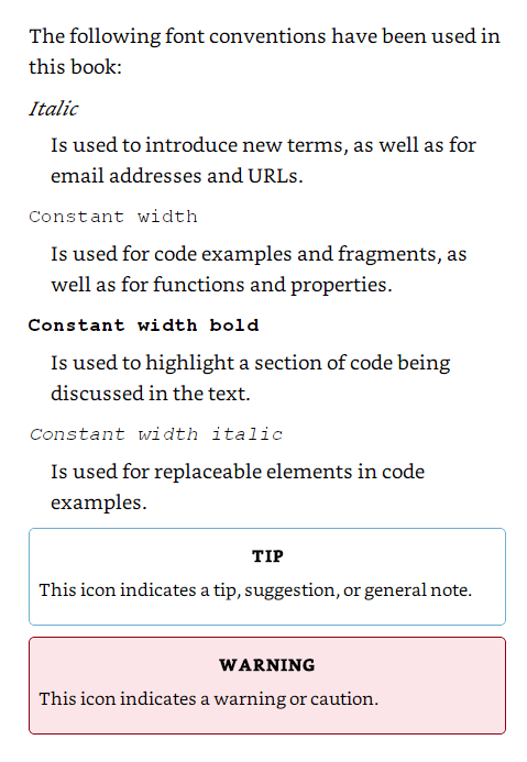
User guides often place a chart for the meanings of highlighting fonts, colors, and typography in the preface:
I would appreciate your thoughts, reactions, criticism regarding this chapter: your response.
