One of the nice things about technical writing courses is that most of the papers have tables, charts, and graphs in them—or at least they should. A lot of professional, technical writing contains all sorts, tables, pie charts, bar charts, line graphs, flow charts, and so on. Once you get the hang of putting these things into your writing, you should consider yourself obligated to use them whenever the situation would naturally call for them.
TakeawaysMostly for technical-writing students:
|
Tables (Google Docs)
To create a table in Google Docs:
- Open Google Chrome.
- Click
 Blank document.
 - Click File > Rename, and give your file a name. Notice that Google Docs saves your file; there is no Save to click.
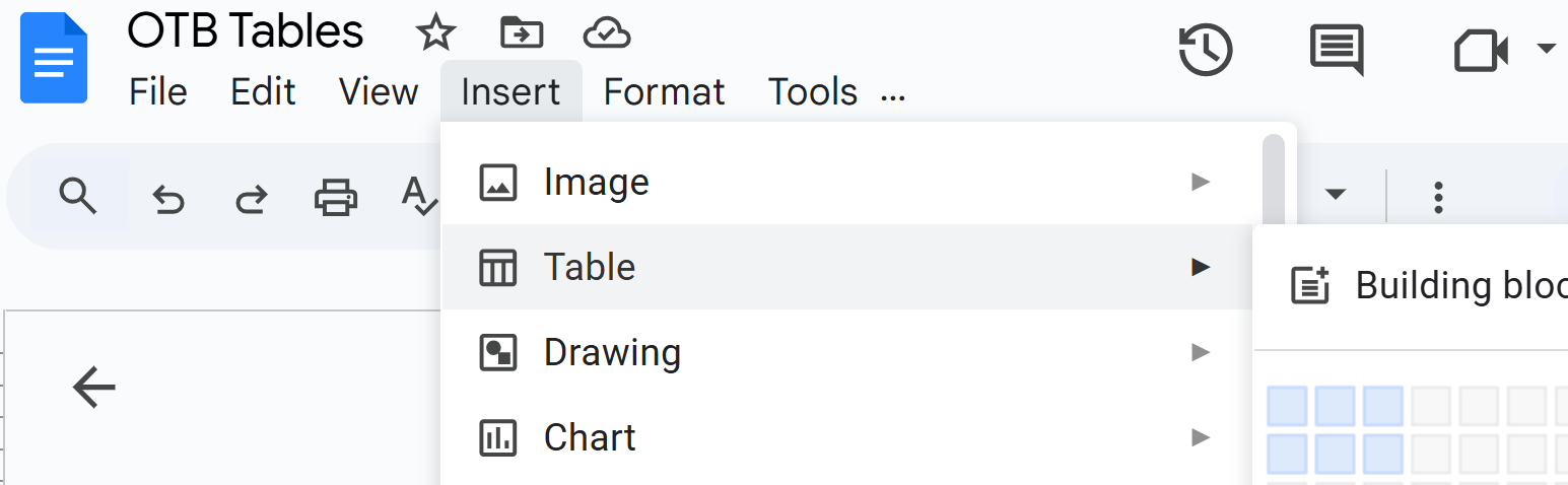
- Click Insert > Tables and select rows and columns for your table:
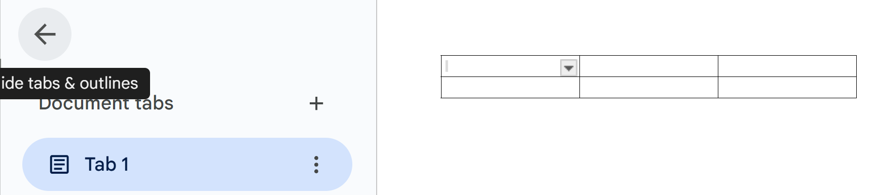
- To free up some screen space, click the left-pointing arrow in the Tabs area:
- To give this table a title, position your cursor in a cell on the first row, click Format > Table > Title row. You can change the size of the title: for example, click Heading 2 and change to Subtitle.
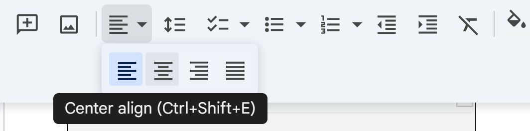
- To change the alignment, for example, to center, click the 3 dots to the right of the font blank (by defaults, Arial), and select the alignment you want:
- To add or delete rows and columns, click Format > Table.
- To shade the background of a row, click all of the cells in a row, click the paint bucket on the tool bar:

Notice the other functions of this toolbar: for example, A enables you to change the color of selected text. The pencil icon enables you to change background color of selected text.Charts and Graphs (Google Docs, Sheets)
Pie Charts
A pie chart shows the relationship of an item to the whole to which it belongs. For example, imagine a pie chart showing U.S. car sales with pie slices for domestic, European, Japanese, and so on.
To create a simple pie chart in Google Sheets:
- Open Google Chrome.
- Click
 and then Sheets.
 - Click Blank spreadsheeet.
- Move to column B row 3, and create a spreadsheet that looks something like this:

- Select the spreadsheet data you have just entered—all of it.
- Click Insert>Chart>Pie chart:
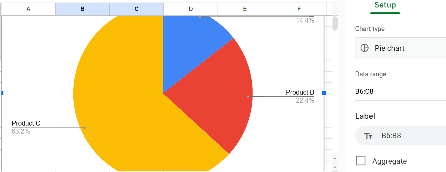
- Click into the area to the right of the pie chart to explore how you can customize the look of this pie chart.
- To use this pie chart in a document, click anywhere in the pie chart area, then click Edit>Copy.
- Paste your pie chart into the document.
Bar and Column Charts
A bar chart (horizontal bars) or column chart (vertical bars) shows the relationship of items to each other to enable direct comparison. For example, imagine a bar chart showing domestic sales of U.S. cars next to domestic sales of Asian cars.
To create a bar chart in Google Sheets:
- Once again, open Google Chrome.
- Click and then Sheets.
- Click Blank spreadsheeet.
- Move to column B row 3, and create a spreadsheet that looks something like this:

- Select the spreadsheet data you have just entered—all of it.
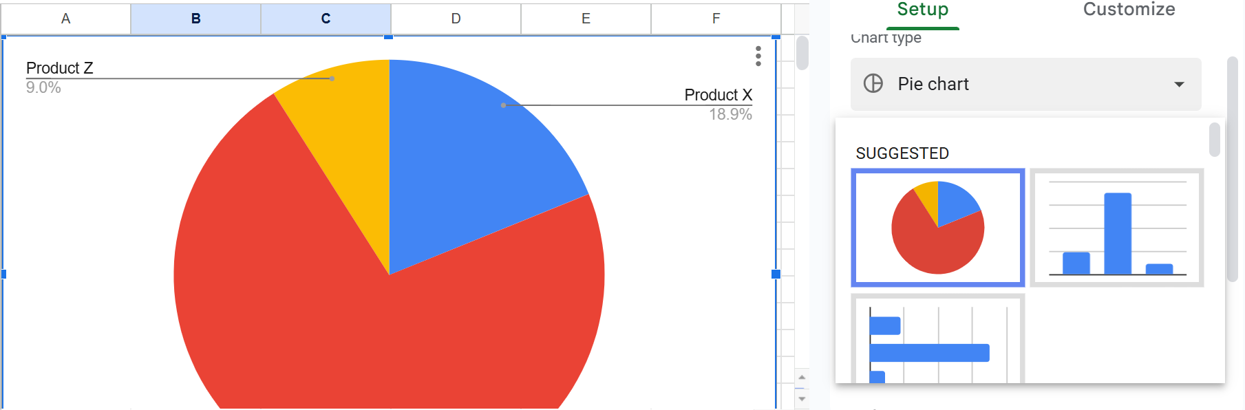
- If you have just created a pie chart, Google Sheets will happily create and display another one for you. Just select and press Delete.
- Click the down arrow next to Pie chart, and look at the bar chart options you have:
- Click either the column chart or the bar to the right of the spreadsheet:

- To use this column chart in a document, click anywhere in the column chart area, then click Edit>Copy.
- Paste your column chart into the document.
Line Charts (Graphs)
Google calls them "line charts," which brings the name in line with its other charts, but others call them "graphs."
To create a simple line graph in Google Sheets:
- Once more, open Google Chrome.
- Click and then Sheets.
- Click Blank spreadsheeet.
- Move to column B row 3, and create a spreadsheet that looks something like this:

- If you have just created a pie chart, Google Sheets will happily create and display another one for you. Just select and press Delete.
- Click the down arrow next to Pie chart, and look for the line chart option, which as multiple graph lines in it:

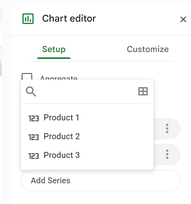
- If your line chart lacks one or more graph lines, click Setup:
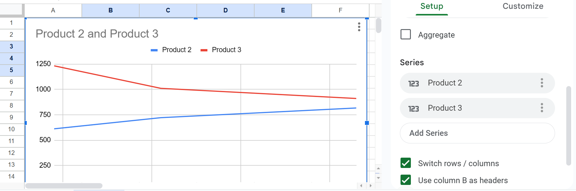
- Click Add series and select the missing item:
- Axis labels—Indicate what the x and y axes represent.
- Keys (legends)— Indicate what special color, shading, or line style (solid or dashed) mean. Include them in a key (a box) in some unused place in the chart or graph.
- Figure titles (captions)—For most charts and graphs, include a title, in many cases, a numbered title. Don't forget to cite the source of any information you borrowed. The standard rule for when to number figures or tables is this: if you cross-reference the figure or table elsewhere in the text.
- Cross-references— Put a cross-reference to the chart or graph from the related text. WIn the cross-reference, explain what is going on in the graphic, how to interpret it, what its basic trends are.
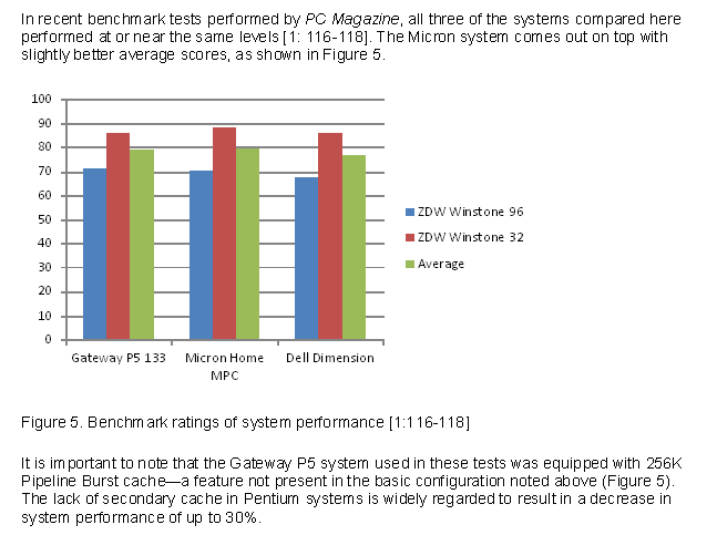 Example of a column chart. Notice that text above and below the chart calls attention to the chart and briefly indicates its significance.
- To edit the title of, for example, the line chart, click Customize > Chart > axis titles, and enter a title under Title text:

- To add a y-axis label, click Vertical axis title and type the in the Title text blank.
Maybe your line chart resembles this:

Explanatory Cross-References for Charts and Graphs
You can't just throw in a figure or a table and say "See Figure 1" or "See Table 1." That's rude and a lost chance for technical communication. Provide before or after a brief explanation of what to look for in the chart or graph. For example, mention on main point or trend.
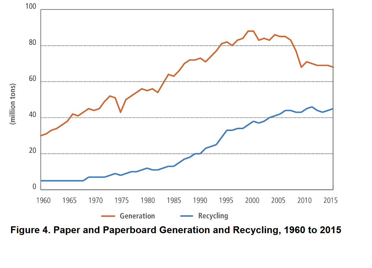
As can be seen in Figure 4, generated paper materials have outdistanced recycled paper materials 6730 million tons 4760 million tons over the the 1960 to 2015 period.
Here's another example of an explanatory cross-reference:
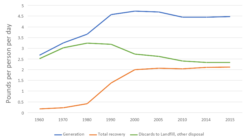
Figure 6. MSW Pounds per Person per Day
As you can see in the figure above, progress in recovery of municipal solid waste (MSW) was increasing until year 2000 but has stalled since then.
Save Charts and Graphs for Other Applications
Google Docs enable you to download your document to your computer:
- Click File.
- Click Download.
- Select Microsoft Word (.docx) or whichever format you prefer.
Related Information
Almost Everything You Wanted to Know About Making Tables and Figures. A fantastic resource from Department of Biology, Bates College, Lewiston, ME, 2012.
I would appreciate your thoughts, reactions, criticism regarding this chapter: your response—David McMurrey.
- To edit the title of, for example, the line chart, click Customize > Chart > axis titles, and enter a title under Title text:
Titles and Axis Labels for Charts and Graphs
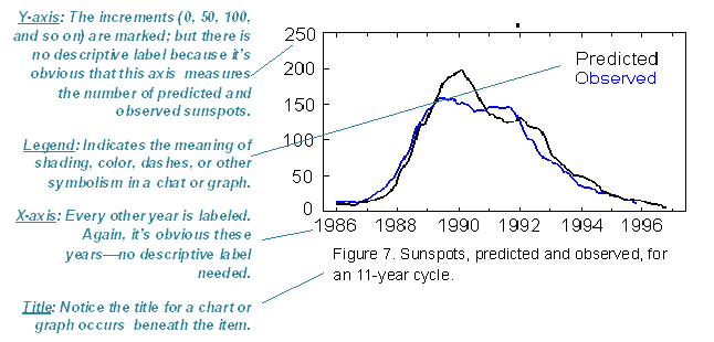
Example of a graph. Notice that a figure title is placed beneath the graph.
