Please click here to help David McMurrey pay for web hosting:
Donate any small amount you can !
Online Technical Writing will remain free.
A resume is a selective record of your background—your educational, military and work experience, your certifications, abilities, and so on. You send it, sometimes accompanied by an application letter, to potential employers when you are seeking job interviews.
A resume should be easily readable, effectively designed, and adapted to audience expectations. If you are taking a technical writing course, your instructor may be okay with your making up a few details in your resume to represent what you'll be when you graduate. However, if you're just starting your college education and have little work experience, why not try using the techniques and suggestions here to create a resume that represents your current skills, abilities, and background? Developing a decent-looking resume based on what you are now is a challenge that you have to deal with at some point—so why not now?
Note: Take a look at some published research on how employers read resumes and what works with resume design.
Front-end developer. Take a look at a new resume format that has become popular in the last few years.
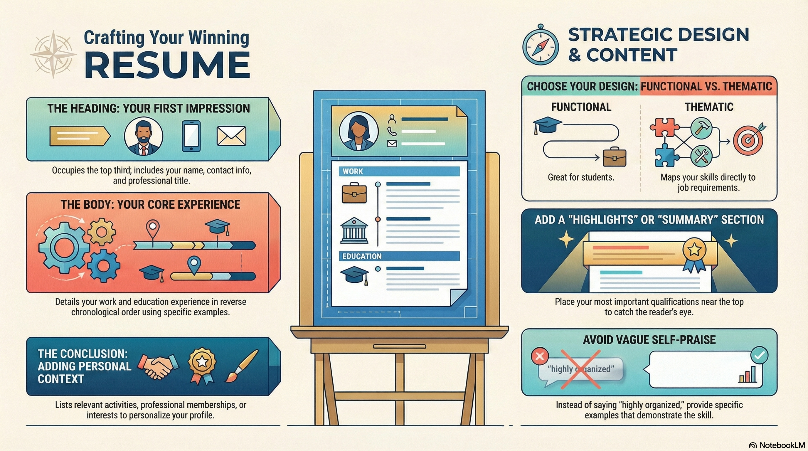
NotebookLM-generated infographic of this chapter
AI-Generated Resume Information—Caution!
Watch out about using AI-generated text verbatim. Notice how obvious this excerpt from an AI-based resume site is :
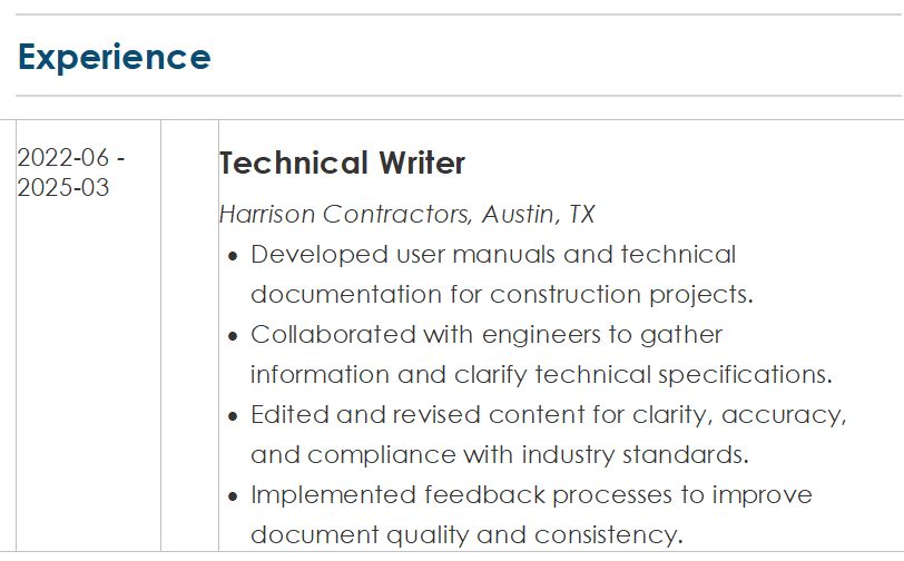
Notice that there are no numeric details, no capitalization of project names or project teams. On the basis of this obvious fakery alone, a resume might get a failing grade in a technical writing course.
Resume Design—An Overview
With desktop publishing and high-quality printing, people sometimes rewrite their resumes for every new job they go after. For example, a person who seeks employment both with a community college and with a software-development company would use two different resumes. The content, organization, format, and emphases would be quite different.
You are probably aware of resume-writing software and templates (such as provided by Microsoft Word): you feed your data into them and they churn out a prefab resume. Resume-writing services will create your resume for you for a hundred dollars. If you are in a time bind or if you are extremely insecure about your writing or resume-designing skills, these services might help. But often they take your information and put it into a computer database that then force it into a prefab structure. They often use the same resume-writing software just mentioned; they charge you about what the software costs. The problem is that these agencies simply cannot be that sensitive or perceptive about your background or your employment search. Why not learn the skills and techniques of writing your own resume here, save the money, and write better resumes anyway?
There is no one right way to write a resume. Every person's background, employment needs, and career objectives are different, thus necessitating unique resume designs. Every detail, every aspect of your resume must start with who you are, what your background is, what the potential employer is looking for, and what your employment goals are—not with from some prefab design. Therefore, use this chapter to design your own resume; browse through the various formats; play around with them until you find one that works for you.
Be sure and check out the examples accompanying this chapter.
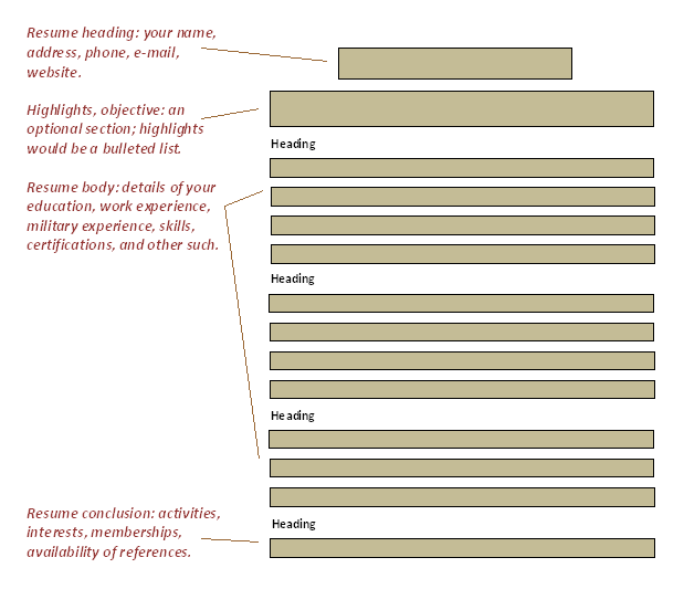
Basic sections of a resume. Whichever format you use, the information generally divides up as shown here.
Sections in Resumes
Resumes can be divided into three sections: the heading, the body, and the conclusion. Each of these sections has common contents.
Heading. The top third of the resume is the heading— your name, phone numbers, e-mail address, and other details such as your occupation and titles. Some resume writers include the name of their profession, occupation, or field. In some examples, you'll see writers putting things like "CERTIFIED PHYSICAL THERAPIST" very prominently in the heading. Headings can also contain a goals and objectives subsection and a highlights subsection. These two special subsections are described later in "Special Sections in Resumes."
Body. In a one-page resume, the body is the middle portion, taking up about half of the total space of the resume. Here, you present the details of your work, education, and military experience—arranged in reverse chronological order. You might also include your accomplishments, publications, certifications, equipment you are familiar with, and so on. There are many ways to present this information:
- You can divide it functionally—into separate sections for work experience and education.
- You can divide it thematically—into separate sections for the different areas of your experience and education.
Conclusion. In the final third or quarter of the resume, you can present other related information on your background. For example, you can list activities, professional associations, memberships, hobbies, and interests. At the bottom of the resume, people often put "REFERENCES AVAILABLE ON REQUEST" and the date of preparation of the resume. At first, it might seem that listing personal, nonwork information would be totally irrelevant and inappropriate. Actually, it can come in handy—it personalizes you to potential employers and gives you something to chat while you're waiting for the coffee machine or the elevator. For example, if you mention in your resume that you raise goats, that gives the interviewer something to chat with you about during those moments of otherwise uncomfortable silence.
Resumes—Types and Design
To begin planning your resume, decide which type of resume you need. This decision is in part based on requirements that prospective employers may have, and in part based on what your background and employment needs are.
Type of organization. Resumes can be defined according to how information on work and educational experience is handled. There are several basic, commonly used plans or designs you can consider using.
- Functional design: Illustrated schematically below, the functional design starts with a heading; then presents either education or work experience, whichever is stronger or more relevant; then presents the other of these two sections; then ends skills and certifications and with personal information. Students who have not yet begun their careers often find this design the best for their purposes. People with military experience either work the detail in to the education and work-experience sections as appropriate; or they create separate section specifically for military experience at the same level as education and work experience.
- Thematic design: Another approach to resumes is the thematic design, illustrated schematically in the preceding. It divides your experience and education into categories such as project management, budgetary planning, financial tracking, personnel management, customer sales, technical support, publications—whichever areas describe your experience. Map these categories directly to specific employment advertisements. If the job advertisement says that Company ABC wants a person with experience in training, customer service, and sales, then it would be a smart move to design thematic headings around those three requirements.
If you want to use the thematic approach in your resume, take a look at your employment and educational experience—what are the common threads? Project management, program development, troubleshooting, supervision, maintenance, inventory control? Take a look at the job announcement you're responding to—what are the three, four, or five key requirements it mentions? Use these themes to design the body section of your resume. These themes become the headings in the body of the resume. Under these headings you list the employment and educational experience that applies. For example, under a heading like "FINANCIAL RECORDS," you might list the accounting and bookkeeping courses you took in college, the company-sponsored seminars on Excel you took, and the jobs where you actually used these skills.
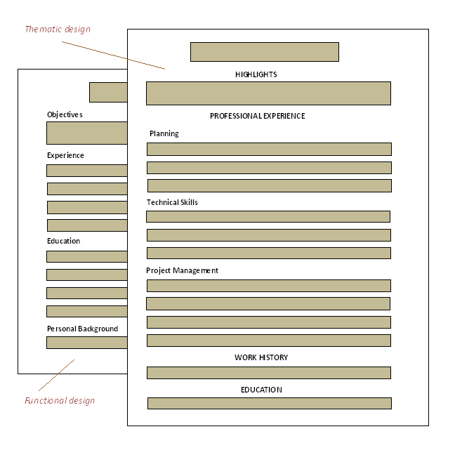
Two basic organizational approaches to resume design. Functional and thematic. (The "hanging-head" format is used in the functional-design version.)
Type of information. Types of resumes can be defined according to the amount and kind of information they present
- Objective resumes: This type just gives dates, names, titles, no qualitative salesmanship information. These are very lean, terse resumes. In technical-writing courses, you are typically asked not to write this type. The objective-resume style is useful in resumes that use the thematic approach or that emphasize the summary/highlights section. By its very nature, you can see that the thematic approach is unclear about the actual history of employment. It's harder to tell where the person was, what she was doing, year by year.
- Detailed resumes: This type provides not only dates, titles, and names, but also details about your responsibilities and statements about the quality and effectiveness of your work. This is the type most people write, and the type that is the focus of most technical-writing courses. The rest of the details in this section of this chapter focus on writing the detailed resume.
Layout, Detail Formats, and Details in Resumes
At some point in your resume planning, think schematically about the layout and design of the thing. General layout has to do with the design and location of the heading, the headings for the individual sections, and the orientation of the detailed text in relation to those headings. Detail formats are the way you choose to arrange and present the details of your education and work experience.
Layout. Look at resumes in this book and in other sources strictly in terms of the style and placement of the headings, the shape of the text (the paragraphs) in the resumes, and the orientation of these two elements with each other. Some resumes have the headings centered; others are on the left margin. Notice that the actual text—the paragraphs—of resumes typically does not extend to the far left margin. Full-length lines are not considered as readable or scannable as the shorter ones you see illustrated in the examples here.
Notice that many resumes use a "hanging-head" format. The heading starts on the far left margin while the text is indented an inch or more. This format makes the heading stand out more and the text more scannable. Notice also that in some of the text paragraphs of resumes, special typography is used to highlight the name of the organization or the job title.
Detail formats. Make the fundamental decision about how you present the details of your work and education experience. Several examples of typical presentational techniques are shown below. The elements you work with include:
- Occupation, position, job title
- Company or organization name
- Time period you were there
- Key details about your accomplishments and responsibilities while there.
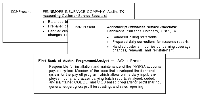
Examples of detail formats. Use combinations of list or paragraph format, italics, bold, all caps on the four main elements: date, organization name, job title, and details.
There are many different ways to format this information. It all depends on what you want to emphasize and how much or how little information you have (whether you are struggling to fit it all on one page or struggling to make it fill one page). Several different detail formats are shown above.
Details details details! As the application letter chapter emphasizes, to make an application letter great is to work in details, examples, specifics about related aspects of your educational and employment background. Same goes for resumes.
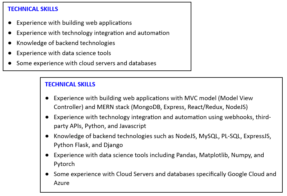
Levels of detail in resumes. Notice how the brief general version at the top says practically nothing. The version below provides plenty of persuasive eye-catching detail.
Special Sections in Resumes
Here are some ideas for special resume sections, sections that emphasize your goals or qualifications.
Highlights, summary section. In the illustration below, you'll notice the "Highlights" section that occurs just below the heading (the section for name, address, phone number, etc.) and just above the main experience and education sections. This is a popular section in resumes. Resume specialists believe that the eye makes first contact with a page somewhere one-fourth to one-third of the way down the page—not at the very top. If you believe that, put your very "best stuff" at that point. People commonly list their most important qualifications, their key skills, their key work experience in that space on the page. Actually, this section is useful more for people who have been in their careers for a while. It's a good way to create one common spot on the resume to list those key qualifications about yourself that may be spread throughout the resume. Otherwise, these key details about yourself are scattered across your various employment and educational experience—in fact, buried in them.
Note: This is a good point to discuss the inclusion of "sez-who" information. Here are some examples:
Highly organized, proactive, strong knowledge of security tools
Excellent interpersonal and communication skills
Computer savvy
Positive Attitude
Adapt quickly to change
Highly organized
These are simply love-notes-to-self. Avoid them! The reader wants to ask "sez who?" with the answer being the writer of those love notes. A less wordy approach would be to proclaim "I am wonderful!" A legitimate way to express these values would be examples where they were observably in play.
Objectives, goals. Also found in some resumes is a line just under the heading in which you list key goals or objectives. Some resume writers shy away from including a section like this because it might cause some employers to stop reading.
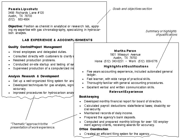
Special sections in resumes. Summary or highlights of qualifications, and goals and objectives section.
Amplifications page. Some people have a lot of detail that they want to convey about their qualifications but that does not fit well in any of the typical resume designs. For example, certain computer specialists can list dozens of hardware and software products they have experience with—and they feel they must include it all. To keep the main part of the resume from becoming unbalanced and less readable, they shift this detail to an amplications page. There, the computer specialist can categorize and list all that extensive experience in many different operating systems, hardware configurations, and software applications. Similarly, some resume writers want to show lots more detail about the responsibilities and duties they have managed in past employment. The standard formats for resume design just do not accommodate this sort of detail; and this is where the amplifications page can be useful.
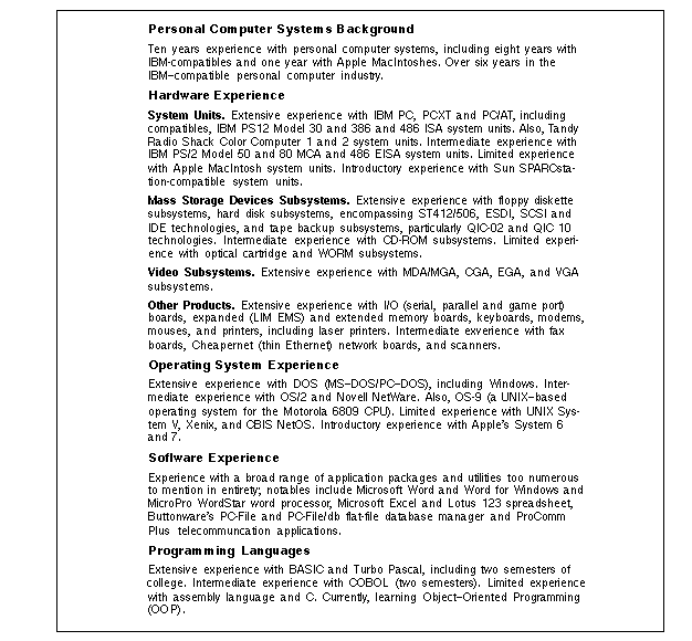
Amplifications page in a resume. If you have lots of detail about what you know, this approach on page 2 of the resume may work. On the first page of this resume, the writer divides the presentation into experience and education sections and takes a chronological approach to each. On the first page, he only provides company names, job titles, dates, and discussion of duties.
See Resume templates. From Canva
Following pages. If your resume is longer than one page, the heading at the top of subsequent pages can be handled imilar to what is shown below. The information in the following page header is the name of the resume writer, page number, and date:

Example of a following-page header in a resume. (Editing within the header area.)
If you use letterhead stationery, remember not to use it for subsequent pages. However, you must use blank paper of the same quality, weight, and texture as the letterhead paper (usually, letterhead stationery comes with matching blank paper).
Early-Career Resumes
If you are at the beginning of your career, all the advice and examples to this point may seem fine and good, but what if you have very little experience? Careers must start somewhere—and so must resumes. You can use several strategies to fill out your resume so that you appear to be the promising entry-level candidate that we all know you are.
- Cite relevant projects (both in academia and community) you've worked on, even if they are not exactly related to the career that you pursue.
- Spend extra time describing college courses and programs you have been involved in. What about team projects, research projects, or reports?
- Include volunteer work that has had any trace of technical in it. (If you've not done any volunteer work, get to volunteering!)
- List any organizations you have been a member of and describe any of their activities that have any trace of technical in them. (If you've not belonged to any technically oriented organizations, get to belonging!)
In the student resume shown below, notice how much space that details about education take up. This resume writer could have included even more: Descriptions of key courses and projects could have been provided under a subheading such as "Essential Coursework."
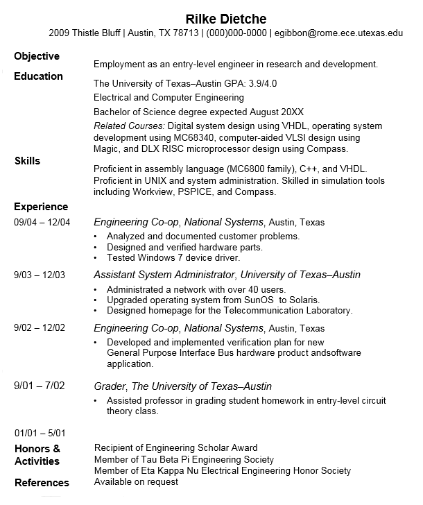
Early-career resume. Use the strategies suggested here to fill out your resume with good information.
Notice too that the resume above includes plenty of co-op and part-time work. The bulleted-list format extends the length of the resume so that it fills up the page. At the bottom of the resume, the writer lists awards and organizations. These too could be amplified if necessary. Details as to what the award is about, why this writer received it, and what those organizations are—these are examples of good information that could be added.
Here's another example that provides lots of detail about courses taken. Detail like this can help overcome a lack of work experience.
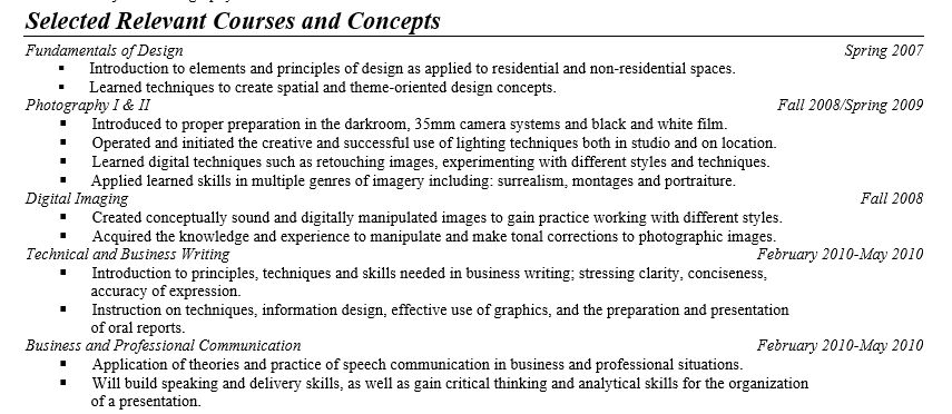
Another early-career resume.
Subtle changes in format can also help make your resume fill a page. Top, bottom, left, and right margins can all be pushed down, up, and in from the standard 1.0 inch to 1.25 inches. You can add extra space between sections. To do so, don't just press Enter. Instead, put 6 or 9 points, for example, below the final element of each section. Line spacing is a another subtle way to extend a resume change the default 13.6 points of line spacing for Times New Roman 12 point text to exactly 15.0 points, for example.
One temptation for early-career resume builders—and others who are just too busy—is to use generative Ai to build a resume. The result: a useless generic mess like this:
|
Resume Published Research and Advice
The following links open in a separate browsesr.
- How To Beat The Dreaded Job Application Tracking System
- Resume Templates. Focus is on internships!
- See Resume templates. From Canva
- How to Rock Your CV with a Soft Skills Section [Tips, Examples, 2022 Advice]. StudyCorgi, 2022.
- F pattern reading research. Serious research on how people look at and read resumes. Nielsen Norman Group, 2022.
- The Complete Resume Format Guide For 2018. Trade and workplace "best practices" according to The Interview Guys, 2018
- 14 Tips for Writing a Rockstar Resume. Best practices according to glassdoor.com, 2018.
- 10 Resume Writing Tips for 2018. Best practices according to Jessica Hernandez, LinkedIn, 2022.
- 4 Things Employers Look For In Resumes. According to glassdoor.com, 2018.
- What Employers Seek on a Resume. National Association of Colleges and Employers, 2022.
- How to Write a CV: 11 Useful Tips. Yvonne McQuarrie, IvyPanda Blog, 2019.
- General Guidelines for Creating Job Application Forms (With Template). Audience is employers. indeed.com
AI Prompts for Resumes
Checklists, which typically go unread, can be used as source for AI prompts with some modification. Copy the following, paste it into an AI system such as Google's Gemini, and see what you may have missed.
Note: All references to the content, format, style of resumes or their components can be found in the online technical-writing textbook.
|
AI Prompts for Resumes Hello, AI. I am requesting that you evaluate an resume written by a U.S. college sophomore. Below is a summary of textbook chapter on resumes to use as the basis of your evaluation. (Identifying information masked):
|
Related Information
Mechanical Engineering Resume, Cover Letter, Portfolio Suggestions. hardwareishard.com
Convert Your Resume to an ATS-Friendly Format. Includes a resume scanner.
Your Resume Is Getting REJECTED by ATS (Here’s How to FIX IT)
Death of the Resume?. businessinsider.com
How to Use AI for Your Resume: What 1.7M Applications Say Works in 2026. The claims Huntr makes are as questionable, dubious as those of other sites like this. But valuable in this link are the recommendations it provides.
General business correspondence
Common Grammar, Usage, Spelling Problems
I would appreciate your thoughts, reactions, criticism regarding this chapter: your response—David McMurrey.
