页面设计 对不同的人来说有不同的意思,但在这里它指的是您在专业设计的文档中看到的排版和格式使用。
我们在这里的重点是技术文档,这意味着简约、实用的设计。
有关您在这里看到的更详细信息,请参考这两个行业标准资源:
- Sun 技术文档。 请先阅读我! 任何近期版本。普伦蒂斯霍尔。
- 微软公司。 微软技术出版物手册任何最近的版本。微软出版社。
页眉和页脚
人们常常把标题和标题混淆。标题,涵盖在 标题 那些短语会出现吗 身体区域内 文档的标题是那些可能出现的短语和页码。 在标题区域内 文档的页脚是指出现在页面底部的短语和可能的页码。 在页脚区域内 文档的标题放在页眉区域是一个常见且严重的错误,这会导致标题出现在每一页的顶部。
查看典型文档页面的示意图:
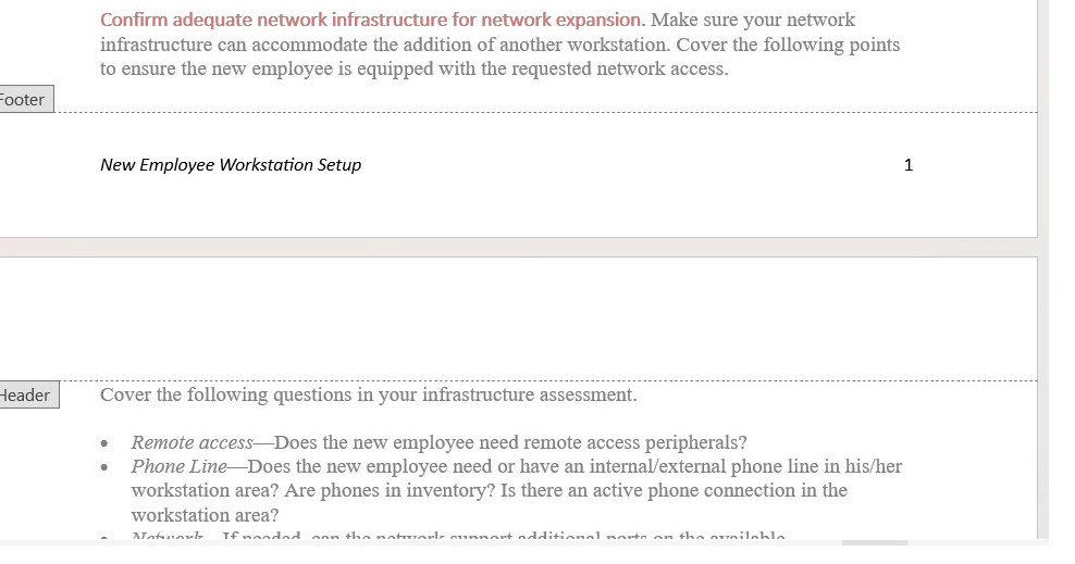
一种常见的页面设计是在页脚区域放置文档标题和页码。在交替格式中,左页可能按顺序显示页码和文档标题;右页可能按顺序显示文档标题和页码。
标题
以下是关于标题的一些标准指南。有关更详细的讨论,请参见章节内容。 标题 在在线教科书中。
- 大肆使用标题 也许每两到三个段落使用一个标题。 当然,标题也可以过多:每个标题只有一两句话的情况并不奏效。
- 设计标题,使其清晰地指示其级别。使用字体大小、字体样式、颜色、粗体、斜体、对齐等方式,使标题级别显而易见。(标题的“级别”类似于大纲中的级别:第一层级对应于罗马数字;第二层级对应于大写字母;依此类推。)
- 使标题能清楚地描述它们所介绍的部分。像“技术背景”这样的标题对任何人都没有明确的指引。
- 制作标题 平行 在措辞上。平行结构为读者提供了重要线索,以判断这一部分是否与前面的部分在性质上相似。
- 避免“单独标题”—这和大纲中有“A”却没有“B”或“1”却没有“2”的概念是一样的。
- 避免“堆叠标题”—也就是两个或更多连续的标题之间没有插入文本。
- 避免在标题下的文本中使用代词。如果有一个标题,如“配置软件”,请不要跟着一句“下一阶段……”。
- 考虑使用“悬挂式标题”格式,使标题更加突出,并减少常规文本行的长度。在悬挂式设计中,部分或全部标题位于左边边距,而所有文本则缩进一到两英寸。
- 考虑使用“行内”标题作为最低级别标题。仅依靠字体样式和大小来指示标题级别可能会很困难。行内标题“融入”段落的开头,并以句号结束。您可以对这些标题使用粗体、斜体或颜色的组合。
列表
列表是强调重要点、快速浏览文本以及提供更多空白空间的有用工具。以下是一些关于列表的标准指南。欲了解更详细的讨论,请参见章节。 列表.
- 对于需要顺序或必须按数字引用的项目,请使用编号列表。对于无特定顺序的项目,请使用项目符号列表。
- 使用文字处理软件、HTML标签等中的标准编号和项目符号列表格式。
- 使列表项目的措辞更加清晰 平行.
- 在介绍列表时,请加上引导语;不要使用标题作为列表的引导语。
- 除非您组织的风格有不同规定,否则只有在项目是完整句子或包含嵌入从句时,才能使用句号进行标点。
- 在列表项的第一个词上使用首字母大写或小写,但要保持一致。
- 对于嵌套列表,第二级列表项使用加粗的长破折号作为项目符号;第二级编号列表项使用小写字母。确保嵌套项对齐到 文本 或上一级。
- 避免过度使用列表或包含过多项目的列表。七到十个项目通常被认为是列表的最大数量。
通知
通知是那些特殊格式的文本块,提醒读者注意特殊要点、例外、潜在问题或危险。以下列出了一些通知的标准指南。有关更详细的讨论,请参见章节。 通知.
- 使用一个标准的通知层级,其中通知的严重性越高,其显著性和可见性就越强。
- 考虑使用这个层级:
- 涉及潜在严重受伤或死亡的危险通知
- 涉及轻伤的情况警告
- 涉及设备或数据损坏或对程序成功构成威胁的情况注意事项
- 不涉及前述情况的例外或强调要点的说明。
- 无论您使用什么通知设计,都应避免使用全部加粗、全部斜体、全部大写字母或它们的组合来显示过长的文本。
- 除了告诉读者该做或不该做某事外,还需要解释如果他们忽视警告会发生什么、在什么情况下使用该声明、如果忽视该声明如何恢复。
- 请使通知文字简洁明了,但不要牺牲清晰的表达。避免使用电报式的写作风格(省略冠词等)。 a, 一个, 这) 在通知中。
- 在编号列表中,将通知对齐到 文本 它们适用的列表项。
- 发布通知的标准做法 之前 潜在问题存在的步骤可能会导致格式问题。如果可能,请在整个流程的开始部分说明警告、注意事项或危险。
数字
图形是各种插图、图画、示意图、照片等。请看 图形 进行详细讨论。同时,这里有一些重要要点:
- 在图表之前的文本中,提供对该图的交叉引用。
- 虽然为每个图形包含图例(标题)并不是绝对必要的,但如果你这样做,请将其放在 下面 图形。
- 例如,在说明中,当图形与各个步骤密切相关时,图形标题没有重要功能,也不需要。
表格
表格就像之前讨论的垂直列表,但更有结构和形式。在你的文本中,寻找可以格式化为表格的重复对、三元组或四元组项目。例如,一系列术语和定义是表格的经典用法。以下是一些表格的标准指南。有关更详细的讨论,请参见章节上的 表格.
- 在您的文本中查找可以格式化为表格的重复项组。
- 在表格之前的文本中,提供对表格的交叉引用。
- 使用表格标题,除非表格的内容显而易见且包含项目较少。将表格标题放置。 上面的 将其放在表格中,或将其设置为表格的顶部行。
- 使用列和行标题(或两者)来定义列和行的内容。考虑对这些列和行标题使用某种形式的高亮。
- 左对齐文本列(除非它们是简单的字母字符项)。左对齐文本列与其标题。
- 将数字数据右对齐或按小数点对齐,并在其标题下居中。
- 放置标准测量单位(ft, mm, 加尔。) 在列或行标题中,而不是与列或行中的每个项目一起。
- 请简要讨论表格中的主要趋势,让读者注意到你想要强调的内容。
突出显示
软件文档通常使用大量的突出显示。这里的突出显示是指粗体、斜体、不同的字体、大写字母、引号以及其他用于引起注意的排版技巧。以下是一些突出显示的标准指导原则。有关更详细的讨论,请参见章节。 突出显示.
- 制定高亮使用计划,并一致地应用。出于特定的功能原因使用高亮。避免过多高亮;避免复杂的高亮方案。
- 考虑使用这种相当标准的高亮方案:
- 为了简单的强调,可以使用斜体。
- 对命令、屏幕按钮和菜单选项使用**粗体**。
- 使用斜体字来表示用户必须提供自己词语的变量。
- 在屏幕上显示的文本或用户必须输入的文本中使用替代字体。
- 对于屏幕和字段名称,请使用屏幕上显示的大小写样式,但不使用其他强调。
- 对关键名称使用首字母大写,但不进行其他强调。
- 为了加强强调,请使用通知格式。
边距、缩进与对齐
如标题部分所提到的,一个不错的做法是将正文缩进一到两英寸,同时将标题保持在左边缘。这种风格有两个好处:一是使标题更加突出,二是缩短了正文的行长度。
字体与颜色
关于字体和颜色,这里有一些建议:
- 仅使用一种替代字体,最多两种。例如,您可以使用 Arial 作为标题,使用 Times New Roman 作为正文,使用 Courier New 显示屏幕上的文本或用户必须输入的文本。
- 如果你使用颜色,尽量少用。例如,如果你有黑色文本在白色背景上,你可以为标题选择另一种颜色。你也可以使用同样的颜色作为图表和表格标题,以及通知的标签(实际的“注意”、“警告”、“谨慎”和“危险”标签)。
- 避免使用不寻常的背景和文本颜色组合。例如,紫色或红色文本在黑色背景上很难阅读。除非有强烈的功能原因,否则应坚持使用黑色文本在白色或灰色背景上。
我很想听听你对这一章的想法、反应和批评: 您的回复.
