以下提供了在 Microsoft 365 Word 和 Excel 中创建表格和图表的步骤(2025 年 7 月)。有关使用 Microsoft Word 和 Excel 的步骤,请参见 表格和图表(Microsoft Word, Excel)
外卖内容
主要针对技术写作学生:
- 对于所有非装饰性的表格和图形,请包含交叉引用。 之前 表格或图形.
- 在交叉引用中添加简要说明(“如表1所示...”)。
- 非装饰性表标题位于表格上方。
- 非修饰性图形标题(说明文字)位于图形下方。
- 始终指明非装饰性表格和图形的来源。
表格(Google 文档,表格)
在 Google 文档中创建表格:
- 打开谷歌浏览器。
- 点击
 空白文档.
空白文档. - 点击 文件 > 重命名,并给你的文件命名。注意,Google 文档会自动保存你的文件;没有“保存”按钮。
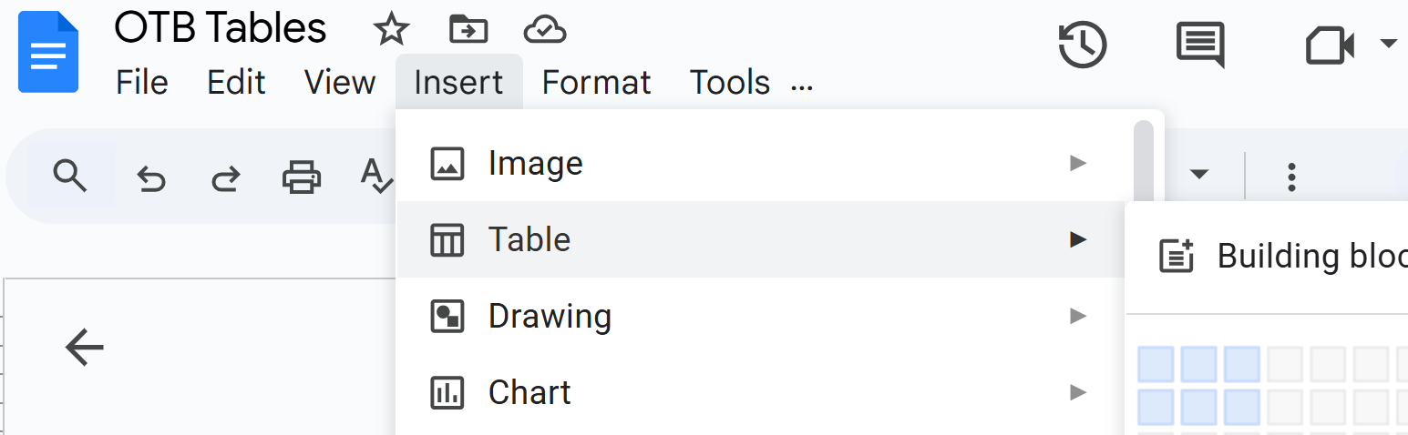
- 点击 插入 > 表格 并为你的表格选择行和列:
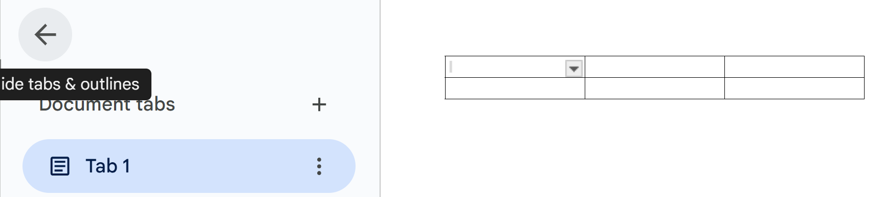
- 要释放一些屏幕空间,请点击选项卡区域的左箭头:
- 要为这个表格添加标题,请将光标放在第一行的一个单元格中,然后点击 格式 > 表 > 标题行您可以更改标题的大小:例如,点击 标题 2 和更改为 副标题.
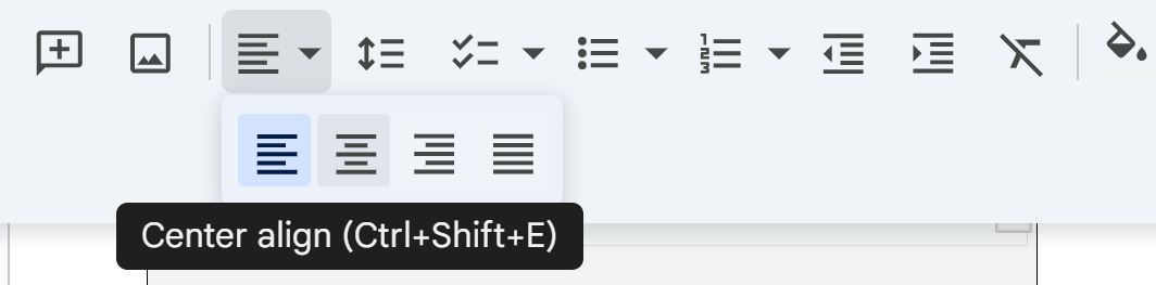
- 要更改对齐方式,例如居中,请点击字体空白右侧的三个点(默认情况下, 阿里尔),并选择您想要的对齐方式:
- 要添加或删除行和列,请点击 格式 > 表格.
- 要给一行的背景上色,请单击该行的所有单元格,然后点击工具栏上的油漆桶:

注意这个工具栏的其他功能:例如, A 可以让您改变选中文本的颜色。铅笔图标可以让您改变选中文本的背景颜色。图表(Google 文档,表格)
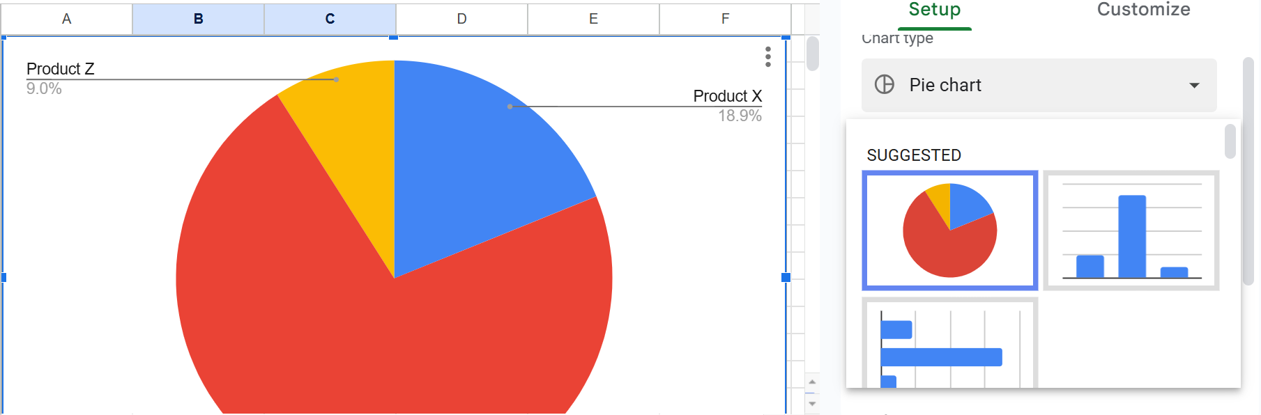
饼图
饼图显示某个项目与其所属整体的关系。例如,想象一个显示美国汽车销售的饼图,其中有国内、欧洲、日本等的饼块。
在 Google 表格中创建简单的饼图:
- 打开Google Chrome。
- 点击
 然后 纸张.
 - 点击 空白电子表格.
- 移动到B列第3行,并创建一个看起来像这样的电子表格:

- 选择您刚刚输入的所有电子表格数据—。
- 点击 插入>图表>饼图:
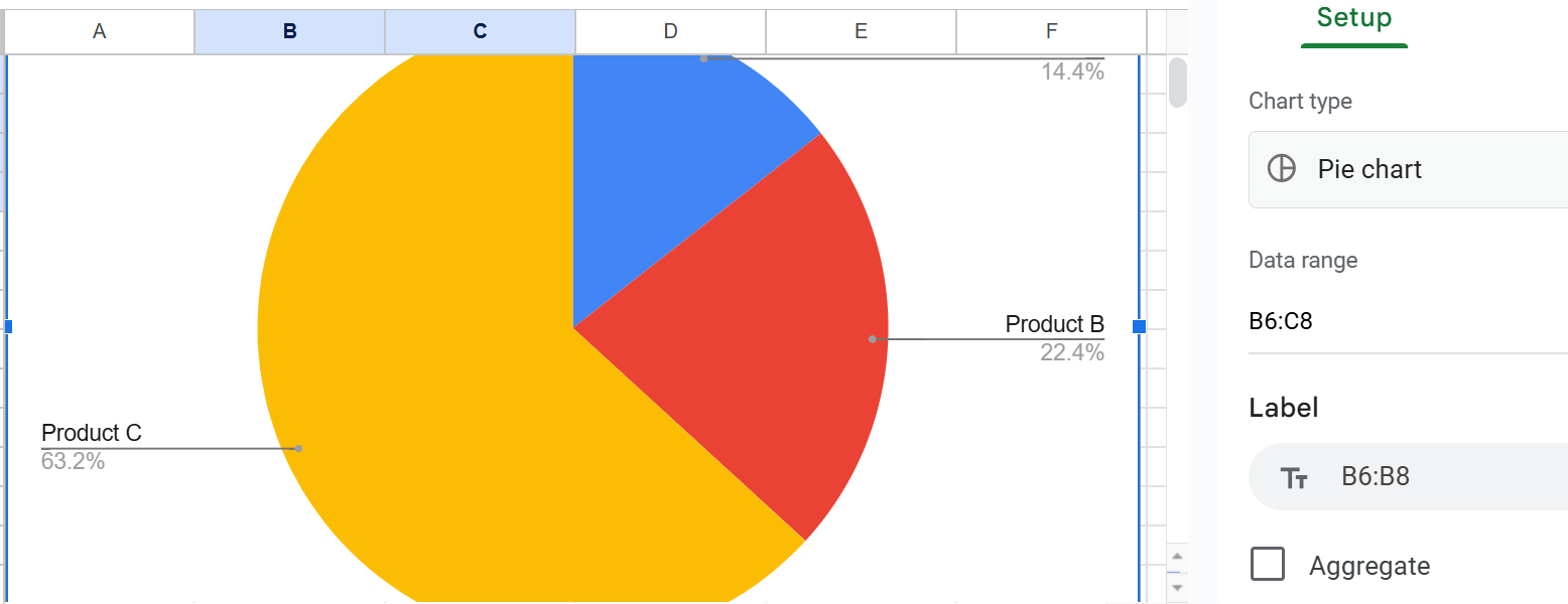
- 点击饼图右侧的区域,探索如何自定义该饼图的外观。
- 要在文档中使用此饼图,请单击饼图区域的任意位置,然后单击 编辑>副本.
- 将饼图粘贴到文档中。
柱条图和柱状图
条形图(水平条)或柱形图(垂直条)显示项目之间的关系,以便进行直接比较。例如,想象一个条形图,展示美国汽车的国内销售与非美国汽车的销售。
在 Google Sheets 中创建柱状图:
- 再次打开 Google Chrome。
- 点击 然后 表格.
- 点击 空白电子表格.
- 移动到B列第3行,创建一个看起来像这样的电子表格:

- 选择您刚刚输入的所有电子表格数据—。
- 如果您刚刚创建了一个饼图,Google 表格会很高兴地为您创建并显示另一个图表。只需选择并按 删除.
- 点击饼图旁边的下箭头,查看您拥有的柱状图选项:
- 点击电子表格右侧的柱状图或条形图:

- 要在文档中使用此柱状图,请单击柱状图区域的任意位置,然后单击 编辑>副本.
- 将您的柱状图粘贴到文档中。
折线图
折线图显示了两个或多个项目随时间的变化。例如,想象一个折线图,其中一条线显示美国汽车销售的变化,而另一条线显示非美国汽车销售的变化。
在Google表格中创建一个简单的折线图:
跟随这个视频: 在 Google Sheets 中创建折线图
标题,轴标签,图例,来源引用,交叉引用
- 图表标题(说明)—对于大多数图表,请包含一个标题,在许多情况下,使用编号标题。编号图形或表格的标准规则是:如果您在文本的其他地方引用该图形或表格。
- 要编辑,例如,折线图的标题,请点击 自定义 > 图表 > 轴标题,并在标题文本下输入标题:

- 坐标轴标签—指示 x 轴和 y 轴分别代表什么。
- 键(图例)— 指明特殊颜色、阴影或线条样式(实线或虚线)的含义。将它们包含在图表或图形的某个未使用的地方的键(一个框)中。
- 交叉引用— 在相关文本中放置指向图表或图形的交叉引用。在交叉引用中,解释图形中的内容,如何解读它,以及其基本趋势是什么。
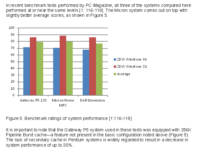 柱形图示例。 注意图表上下的文字引起了对图表的关注,并简要说明了其重要性。
- 要添加 y 轴标签,请点击 纵轴标题 并在标题文本框中输入。
也许你的折线图看起来像这样:

图表和图形的解释性交叉引用
你不能仅仅插入一个图形或表格,然后说“见图1”或“见表1”。这很无礼,也是技术交流的一次失利。在图表之前或之后提供简要说明,告诉读者应该关注什么。例如,提及一个主要观点或趋势。
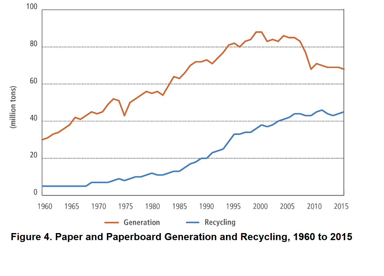
如图4所示,生成的纸质材料在1960年至2015年期间超过了回收纸质材料,达到了6730万吨,而回收纸质材料为4760万吨。
这是另一个解释性交叉引用的例子:
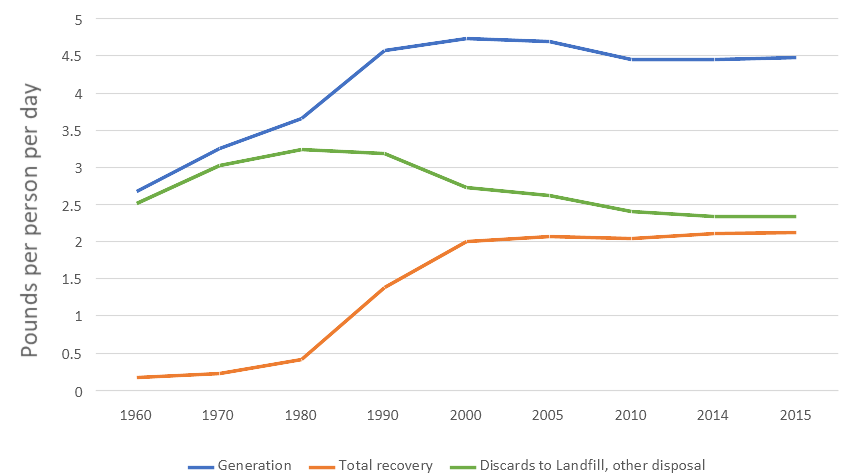
图6. 每人每天的城市固体废物(MSW)磅数
如上图所示,城市固体废物(MSW)回收的进展在2000年之前不断增加,但自那时起停滞不前。
这是另一个解释性交叉引用的例子:
-->
图6. 每人每天的城市固体废物(MSW)磅数
正如您在上面的图中所看到的,城市固体废物 (MSW) 的回收进展在2000年前不断增加,但自那时以来已停滞不前。
保存图表以供其他应用程序使用
Google Docs 允许您将文档下载到您的计算机:
- 点击 文件.
- 点击 下载.
- 选择 微软 Word (.docx) 或您喜欢的任何格式。
相关信息
几乎所有你想知道的关于制作表格和图形的事来自缅因州刘易斯顿贝茨学院生物学系的奇妙资源,2012年。
图表和图形北卡罗来纳大学教堂山分校
如何在 MS Word 中创建表格或图表 展示表格格式,时间为 3:35,之后创建图表。
#17 Excel 365 教程 高级 - 将 Excel 图表链接到 Word 文档
以下是一些定义许多现存图表类型的资源:
- 40+ 图表类型 | 数据讲故事指南(+ 示例)
- 数据可视化—如何选择合适的图表类型?
- 每种图表类型排名—该使用什么,避免使用什么
- AI 图表生成器基于AI的网站,免费生成图表—!
我将很感激您对这一章节的想法、反应和批评: 您的回应—大卫·麦克默瑞.

图表示例。 注意到一个 图形 标题位于图表下方。不要忘记引用你借用的任何信息的来源。????