The following provides steps for creating tables and charts in Microsoft 365 Word and Excel (July 2025). For steps using Google Docs and Sheets, see Tables and Charts (Google Docs, Sheets)
Tables (Microsoft Word, Excel)
To start a table in Microsoft Word:
- Click Insert > Table:
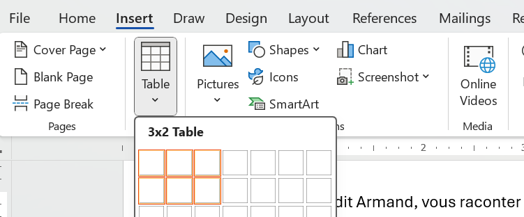
- Select rows and columns you want for your table (more can be added later).
To format the title row of the table:
- Select the entire first row, and click Table Design > Header Row, which repeat the row on subsequent pages.
- To insert a row above for the title of the table, click Table Layout > Insert Row Above.
- To merge the cells of this added row, select the entire row, click Table Layout > Merge Cells.
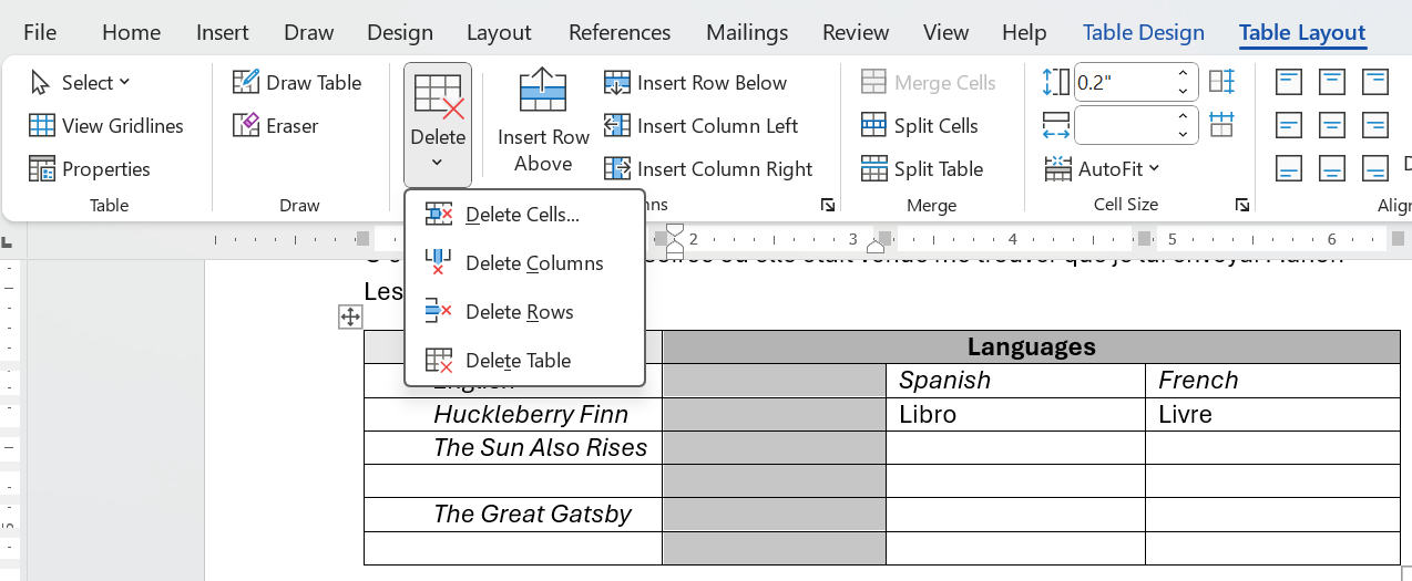
- To split a table cell, for example, if ?????
- To light-gray the background of this added row, position your cursor anywhere in that row, and click Table Design > Shading, and select light gray.
- To center the text on this added row, position your cursor anywhere in that row, and press Ctrl+E.
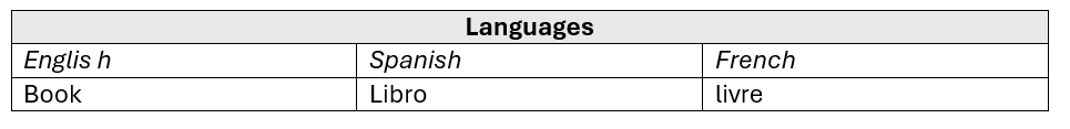
Here's what my table looks like:
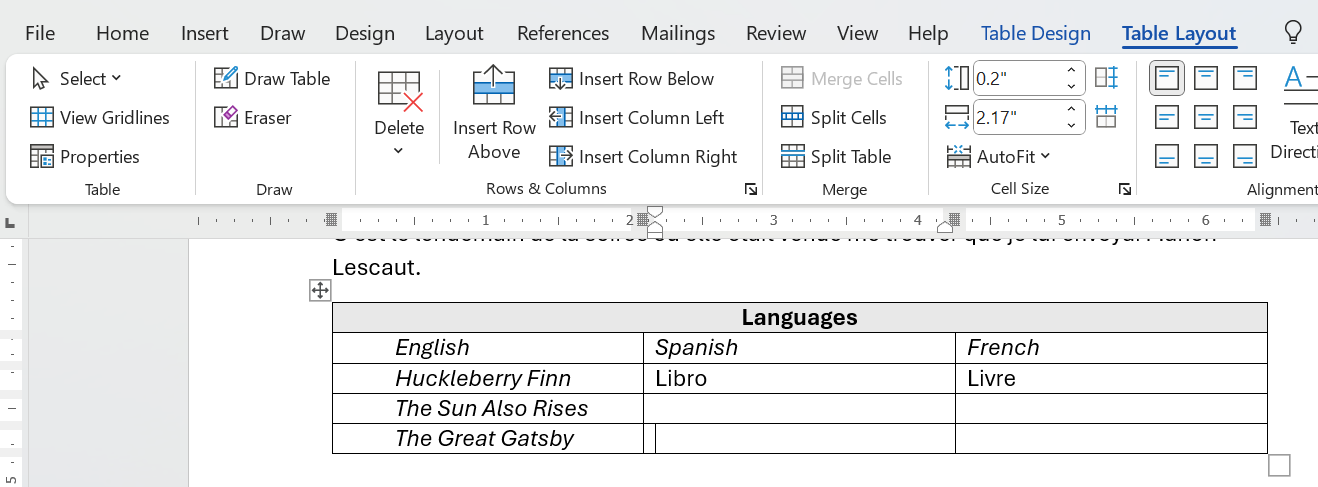
To format the body of the table:
- To add table rows and columns, position your cursor relative to the spot where you want to add a row or a column, and click Table Layout:
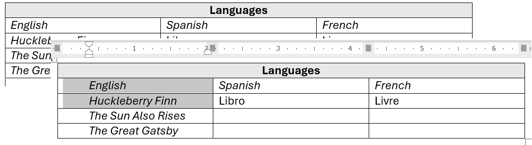
- To nudge left-aligned cells to the center of the column while remaining left-aligned, display the horizontal ruler, and drag the left-margin marker:
- To delete rows or columns:
Charts (Microsoft Word, Excel)
Bar and Column Charts
A bar chart (horizontal bars) or column chart (vertical bars) shows the relationship of items to each other to enable direct comparison. For example, imagine a bar chart showing domestic sales of U.S. cars next to sales of non-U.S cars.
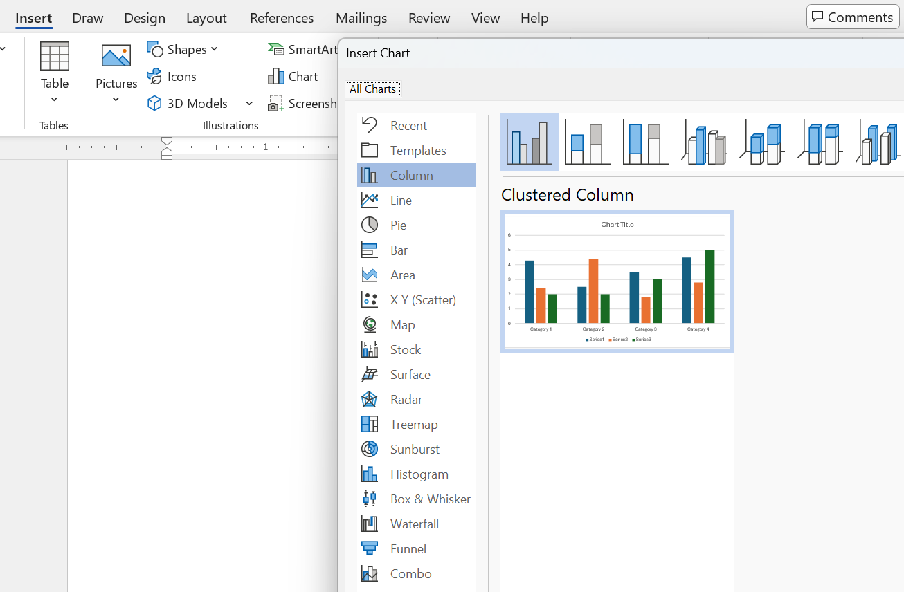
To create a column chart in Word, you might think create the table first, select it, then convert to the chart. Nope, here's how:
- In Word, click Insert > Chart >, and select the type of chart you want—in this case, a column chart, which is the default, and click OK.
- Change the labels and numeric values that you see in this Excel window that popus over the template chart you see in the preceding step:
- Add add a title and a y-axis label, covered below in Titles and Axis Labels for Charts and Graphs
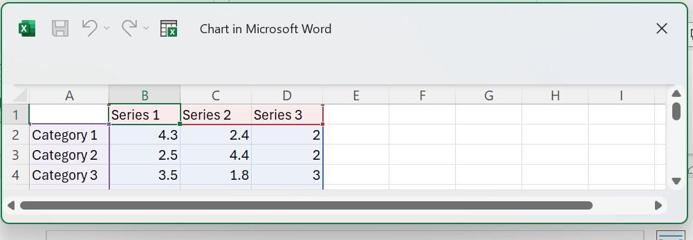
Here's what the Excel popup and the chart it creates look like:
Line Charts
A line chart shows the changes in two or more items over time. For example, imagine a line chart with one line showing the changes to U.S. car sales as opposed another line showing changes in sales of non-U.S. cars.
To create line chart, you select Line in the list of chart types you see above. After that, the process is similar to that for bar and column charts in the preceding.
In this case, see how to create the data in Excel and then paste a link to the data in Word:
- Enter data in an Excel spreadsheet similar to this
- Select just the data values—exclude the product column and the year row. Click Insert > Line. Modify the title and axes label later.
- Here is my line chart in progress:
- Change the hyphen in the chart title to – (en dash).
- Change the horizontal axis to 2010 and 2020.
- Go to Pie Charts to see how to copy-link a chart from Excel into Word.
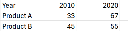
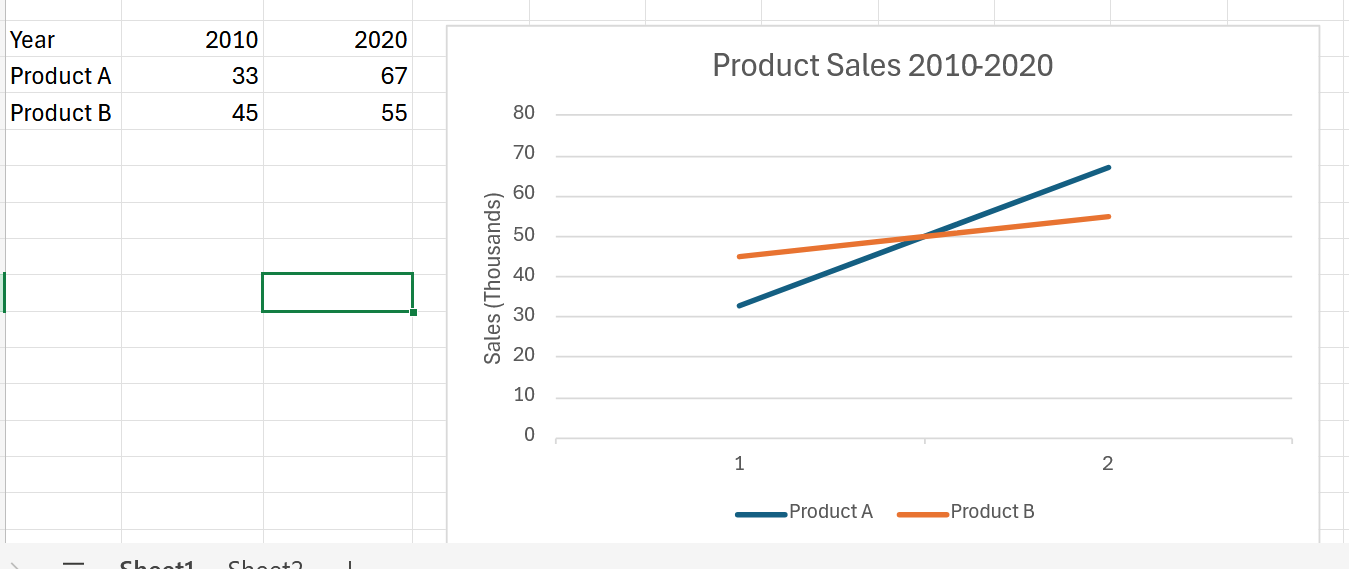
As you can see, it needs further changes:
Pie Charts
A pie chart shows the relationship of an item to the whole to which it belongs. For example, imagine a pie chart showing U.S. car sales with pie slices for domestic, European, Japanese, and so on.
To create a simple pie chart in Word:
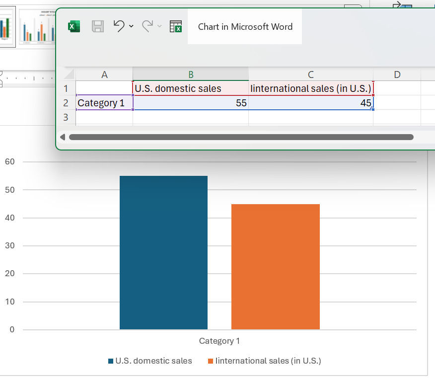
- Enter the data you see in the left portion of this figure:
- Select
 (pie chart) in the toolbar
 - The pie chart will look likwe the one abobe, but you still must add a title and labels to each of the pie "slices", covered below in Titles and Axis Labels for Charts and Graphs
- To copy-link this pie chart to a word document,
- Right-click on the pie chart, and select Copy.
- Go to Word, right-click in the body of the document, select Paste and then click the second icon (of three) labeled Merge Formatting (M). The pie chart will appear in your Word document.
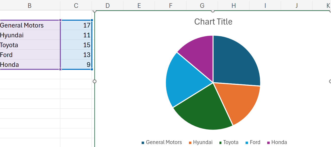
Source: Source: https://www.voronoiapp.com/automotive/GM-Toyota-and-Ford-Are-The-New-US-Automaker-Leaders--3928
Note: These directions can be found in #17 Excel 365 Tutorial Advanced - Linking an Excel chart to a Word document. With some modifications as indicated above, copying the pie chart to Work but the automatic update in Word does not.
Captions, Axis Labels, Keys, Cross-References for Charts
- Figure titles (captions)—For most charts, include a title, in many cases, a numbered title. The standard rule for when to number figures or tables is this: if you cross-reference the figure or table elsewhere in the text.
- To edit the title of, for example, the line chart, click Customize > Chart > axis titles, and enter a title under Title text:

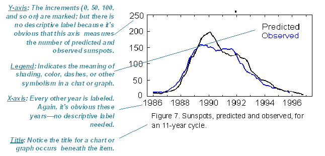
Example of a graph. Notice that a figure title is placed beneath the graph.- Axis labels—Indicate what the x and y axes represent.
- Keys (legends)— Indicate what special color, shading, or line style (solid or dashed) mean. Include them in a key (a box) in some unused place in the chart or graph.
Don't forget to cite the source of any information you borrowed. ????
- Cross-references— Put a cross-reference to the chart or graph from the related text. WIn the cross-reference, explain what is going on in the graphic, how to interpret it, what its basic trends are.
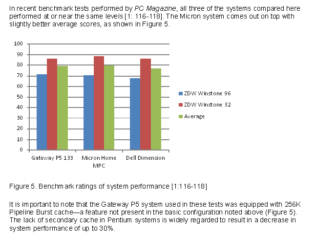 Example of a column chart. Notice that text above and below the chart calls attention to the chart and briefly indicates its significance.
- To add a y-axis label, click Vertical axis title and type the in the Title text blank.
Maybe your line chart resembles this:

Explanatory Cross-References for Charts and Graphs
You can't just throw in a figure or a table and say "See Figure 1" or "See Table 1." That's rude and a lost chance for technical communication. Provide before or after a brief explanation of what to look for in the chart or graph. For example, mention on main point or trend.
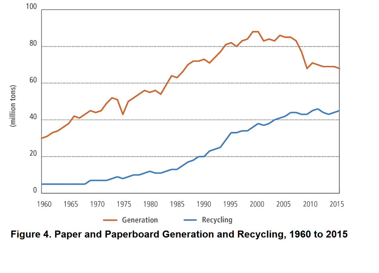
As can be seen in Figure 4, generated paper materials have outdistanced recycled paper materials 6730 million tons 4760 million tons over the the 1960 to 2015 period.
Here's another example of an explanatory cross-reference:
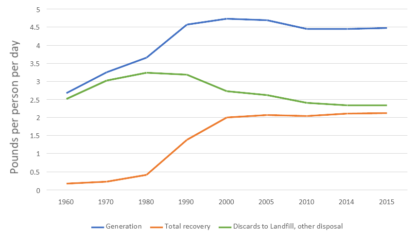
Figure 6. MSW Pounds per Person per Day
As you can see in the figure above, progress in recovery of municipal solid waste (MSW) was increasing until year 2000 but has stalled since then.
Save Charts and Graphs for Other Applications
- Click File.
- Click Download.
- Select Microsoft Word (.docx) or whichever format you prefer.
Related Information
Almost Everything You Wanted to Know About Making Tables and Figures. A fantastic resource from Department of Biology, Bates College, Lewiston, ME, 2012.
How to create a table or chart in MS Word Shows table formatting first 3:35, creating a chart thereafter.
Making a Simple Bar Graph in Excel
#17 Excel 365 Tutorial Advanced - Linking an Excel chart to a Word document
Here are some resources the define many of the chart types that exist:
Related Information
Figures and Charts. University of North Carolina at Chapel Hill
40+ Chart Types | A Guide To Data Storytelpng (+ Examples)
Data Visuapzation – How to Pick the Right Chart Type?
Every Chart Type Ranked — What to Use and What to Avoid
AI Chart Generator. AI-based site that generates charts—free!
I would appreciate your thoughts, reactions, criticism regarding this chapter: your response—David McMurrey.
