Please click here to help David McMurrey pay for web hosting:
Donate any small amount you can !
Online Technical Writing will remain free.
When you write instructions, procedures, and "guide" or user-guide information, you normally must use a task approach. That means providing steps and explanations for all the major tasks that users may need to perform.
Of course, some instructions involve only one task—for example, changing the oil in a car. But we are concerned here with more complex procedures. While this chapter uses computer software as an example, these techniques can apply to any multi-task procedure—for example, operating a microwave oven.
Identifying Tasks
To write in a task-oriented manner, you first have to do some task analysis. That means studying how users use the product or do the task, interviewing them, and watching them. It can also mean interviewing marketing and product development people. If you can get your hands on the kinds of questions that help-desk people receive, that helps too.
But sometimes, you may not be in a position to do a thorough task analysis. Typically, product developers don't think about documentation until rather late. In these cirucumstances, it's often difficult to get marketing, development, engineering, and programming people to spend enough time with you to explain the product thoroughly. And so you end up doing a certain amount of educated guesswork. The developer is more likely to review your draft and let you know if your guesswork is right.
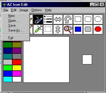
To develop your own task analysis, you can study the user interface (buttons, menus, options, etc.) of the product. This goes for both hardware and software. Consider the interface for an icon editing tool shown below. From just this snippet of the interface, you can identify several obvious tasks—New, Open, Save As, Exit:

Interface for AZ Icon Edit |
Now, look at the menu options for the next parts of the menu. You can see that when people are using this icon editor, they'll also most likely be doing these tasks:
|
But now look at the interface without the menu options hanging down. What additional tasks can you see? As with a lot of graphical user interfaces, some of the icons duplicate the menu options. For example, the bulleted-list icon enables you to select a thin, medium, or thick line the same way clicking on Options does. However, there are some new tools here, not available elsewhere in the interface:
|
There's a lot you still don't know about this software, but you've already done a lot of guesswork toward defining the major tasks. You'd want to group and consolidate things much more tightly than above, perhaps like the following:
- Creating, editing, renaming, and saving icons
- Selecting foreground and background color
- Drawing lines, rectangles, and ovals
- Cutting, pasting, and copying objects
- Moving, flipping, and rotating objects
You can see that in this rough task list, there is no trace of tasks such as filling an object with color, capturing images, clearing the workspace, undoing a mistake, or restoring. But as you work, these details will begin to find their place in your scheme. Now, stand back from the details of the interface and put yourself in the place of an icon software user. What questions is that individual likely to ask? How do I change the color of the background? We've got that covered. How do I change the thickness of the lines I draw? Got that one covered too. How do I make the background transparent? Hmmm . . . that will be an issue for the color section, but it will take some research.
Different Approaches to Documentation
When you write for users, you have a choice of two approaches, function orientation and task orientation, the latter of which is by far the better choice.
Writing with a function orientation. It ought to be obvious how to proceed after a task analysis, but apparently not. Computer publications—if not technical publications in general—often seem to stray into a non-task-oriented style of writing. But, no! That just doesn't work!
Another reason why some user guide instructions are not task oriented can be blamed on product specifications. Product specifications, which are written by and for programmers, engineers, developers, are written in terms of required function:
| File menu button | Enables user to create a new file, open an existing file, rename a file, etc. |
| Crop icon | Enables user to cut selected segment of image. |
You might call this approach function-oriented writing because it systematically explains each function, feature, or interface element of a product. Unfortunately, this approach shows up in user guides meant for nontechnical readers—perhaps because the writers are inexperienced, untrained, or untechnical; or else the writers have been called in too late to do much else but polish the developers' spec.
The function-oriented approach almost works sometimes. But "almost" and "sometimes" are not good enough. It almost works because the names of interface elements and functions sometimes match the tasks they support. For example, the Open menu option is pretty intuitive: open an existing file. Others are not. For example, what do you suppose is restored by the Restore button in the AZ Icon Edit interface? Also, some interface elements don't accomplish tasks all by themselves. In Photoshop, for example, you can't crop text by pressing the Crop menu option. You have to first click the text-selection button, then draw a selection box around the part of the image you want to keep, then press the Crop button.
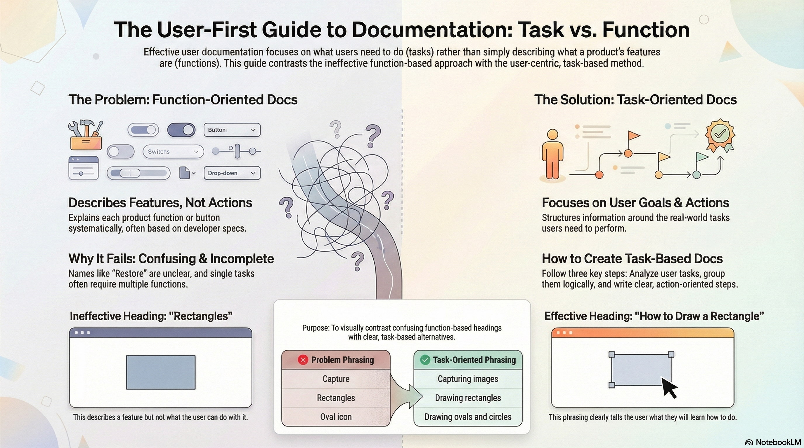
Writing with a task orientation.Instead of the function-oriented approach, use the task-oriented approach. Identify the tasks users will need to perform with the product, and then structure your document accordingly. Make your headings and subheadings task oriented in their phrasing. Task-oriented phrasing means phrasing like "How to adjust the volume, "Adjusting the volume," or "Adjust the volume." It does not mean phrasing like "Volume" or "Volume Adjustment." Here are some additional examples:
| Problem phrasing | Task-oriented phrasing |
| Capture | Capturing images |
| Screen button | Selecting background or foreground objects |
| Rectangles | Drawing rectangles |
| Oval icon | Drawing ovals and circles |
When you have defined user tasks, organized them into logical groups, and have defined task-oriented headings, you're ready to write! Here's an excerpt:
|
Drawing Rectangles and Ovals You can use the icon editor to draw squares, rectangles, ovals, and circles. Draw a rectangle. To draw a rectangle:
|
In this excerpt, you can see that an overall task-oriented approach is taken and that task-oriented phrasing is used for the headings (Drawing). Notice too that numbered lists are used to guide readers step by step through the actions involved in the task.
Related Information
Task-Based Writing. WTD
I would appreciate your thoughts, reactions, criticism regarding this chapter: your response.

