Page design means different things to different people, but here it will mean the use of typography and formatting such as you see in professionally designed documents.
Our focus here is technical documentation, which implies modest, functional design.
For even more detail than you see here, consult these two standard industry resources:
- Sun Technical Pubs. Read Me First! Any recent edition. Prentice Hall.
- Microsoft Corporation. Microsoft Manual of Style for Technical Publications. Any recent edition. Microsoft Press.
Headers and Footers
People often confuse headers with headings. Headings, covered in headings are those phrases occuring within the body area of a document. Headers are those phrases and possibly page numbers occuring within the header area of a document. Footers are those phrases and possibly page numbers occuring within the footer area of a document. A common mistake, and a big one, is to put the title of a document in the header area, which causes it to appear to appear at the top of every subsequent page.
Take a look at a diagram of a typical document page:
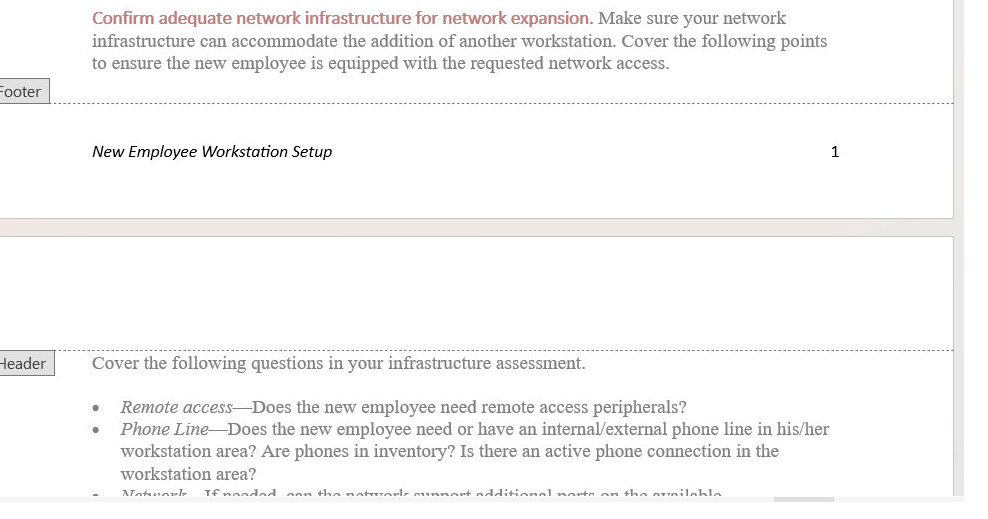
One common page design is to place the document title and the page number in he footer area. In an alternating format, the left page might display the page number and document title, in that order; the right page might display the document title and page number, in that order.
Headings
The following presents some of the standard guidelines on headings. For a more detailed discussion, see the chapter on headings in the online textbook.
- Make liberal use of headings, perhaps one heading for every two to three paragraphs. Of course headings can be overdone: lots of headings with only one or two sentences per heading does not work.
- Design headings so that they clearly indicate their level. Use type size, type style, color, bold, italics, alignment in such a way that the level of the heading is obvious. ("Levels" of headings are like levels in an outline: first level would correspond to the roman numerals; second level, to the capital letters; and so on.)
- Make headings descriptive of the sections they introduce. Headings like "Technical Background" don't tell anybody anything.
- Make headings parallel in phrasing. Parallelism sends readers important clues as to whether the section in similar in nature to the preceding ones.
- Avoid "lone headings"—it's the same concept as having an "A" without a "B" or a "1" without a "2" in outlines.
- Avoid "stacked headings"—that's two or more consecutive headings without intervening text.
- Avoid referring to headings with pronouns in the text following headings. If you have a heading like "Configuring the Software," don't follow it with a sentence like "This next phase..."
- Consider using the "hanging-head" format to make headings stand out more and to reduce the length of regular-text lines. In the hanging-head design, some or all of the headings are on the left margin, while all text is indented one to two inches.
- Consider using "run-in" headings for your lowest-level heading. It can be difficult to rely solely on type style and size to indicate heading levels. A run-in heading "runs into" the beginning of a paragraph and ends with a period. You can use some combination of bold, italic, or color for these headings.
Lists
Lists are useful tools for emphasizing important points, enabling rapid scanning of text, and providing more white space. The following presents some of the standard guidelines on lists. For a more detailed discussion, see the chapter on lists.
- Use numbered lists for items that are in a required order or that must be referred to by number. Use bulleted lists for items in no required order.
- Use standard numbered- and bulleted-list format available in the paragraph styles of word-processing software, HTML tags, and other.
- Make the phrasing of list items parallel.
- Introduce all lists with a lead-in; don't use headings as lead-ins to lists.
- Unless your organization's style overrides, punctuate list items with a period only if they are complete sentences or have embedded dependent clauses.
- Use either initial cap or lowercase on the first word of list items, but do so consistently.
- For nested lists, use a bolded en dash for the bullet symbol in second-level list items; use lowercase letters for second-level numbered list items. Make sure that nested items align to the text or the previous level.
- Avoid excessive use of lists or lists with too many items. Seven to ten items is generally considered about the maximum for lists.
Notices
Notices are those specially formatted chunks of text that alert readers to special points, exceptions, potential problems, or danger. The following presents some of the standard guidelines for notices. For a more detailed discussion, see the chapter on notices.
- Use a standard hierarchy of notices in which notices are more prominent and noticeable as they become more severe.
- Consider using this hierarchy:
- danger notices for situations involving potential severe injury or fatality
- warnings for situations involving minor injury
- cautions for situations involving damage to equipment or data or threat to the success of the procedure
- notes for points of exception or emphasis not involving the preceding situations.
- Whatever notice design you use, avoid extended text in all bold, all italics, all-caps, or combinations thereof.
- In addition to telling readers to do or not to do something, explain what will happen if they ignore the warning, under what conditions to make use of the statement, how to recover if the statement is ignored.
- Make the text of notices succinct, but not at the expense of clear writing. Avoid telegraphic writing style (omission of articles like a, an, the) in notices.
- In numbered lists, align notices to the text of the list item they apply to.
- The standard wisdom of placing notices before the step in which the potential problem exists can cause problems in formatting. If possible, state warnings, cautions or dangers at the beginning of the entire procedure.
Figures
Figures are all manner of illustrations, drawings, schematics, photos and so on. See graphics for detailed discussion. Meanwhile, here are some important points:
- In the text before the figure, provide a cross-reference to the figure.
- While it is not absolutely necessary to include a figure caption (title) for each figure, when you do, place it below the figure.
- For example, in instructions when the figures are closely related to the individual steps, figure titles have no vital function and are not needed.
Tables
Tables are like vertical lists, discussed previously, but more structured and formal. In your text, look for repeating pairs, triplets, or quadruplets of items that can be formatted as tables. For example, a series of terms and definitions is a classic use for tables. The following presents some of the standard guidelines for tables. For a more detailed discussion, see the chapter on tables.
- Look for repeating groups of items in your text that you can format as tables.
- In the text before the table, provide a cross-reference to the table.
- Use a table title unless the content of the table is utterly obvious and the table contains few items. Place the table title above the table, or make it the top row of the table.
- Use column and row headings (or both) to define the contents of the columns and rows. Consider using some sort of highlighting for these column and row headings.
- Left-align text columns (unless they are simple alphabetic character items). Left-align text columns with their headings.
- Right-align or decimal align numerical data, and center it under its heading.
- Put standard measurement units (ft, mm, gal.) in the column or row heading rather than with each item in the column or row.
- Provide a brief discussion of the main trend in the table—what you want readers to notice.
Highlighting
Software documentation typically uses a lot of highlighting. Highlighting here refers to bold, italics, alternate fonts, caps, quotation marks, and other such typographical tricks used to call attention to text. The following presents some standard guidelines for highlighting. For a more detailed discussion, see the chapter on highlighting.
- Establish a plan for use of highlighting, and apply it consistently. Use highlighting for specific, functional reasons. Avoid too much highlighting; avoid complicated highlighting schemes.
- Consider using this fairly standard highlighting scheme:
- For simple emphasis, use italics.
- Use bold for commands, on-screen buttons and menu options.
- Use italics for variables for which users must supply their own words.
- Use an alternate font for text displayed on screen or text that users must type in.
- For screen and field names, use the capitalization style shown on the screen but no other highlighting.
- Use an initial cap for key names but no other highlighting.
- For extended emphasis, use the notice format.
Margins, Indentation & Alignment
As mentioned in the section on headings, a nice touch is to indent text one to two inches while leaving headings on the left margins. This style does two things: it makes the headings stand out, and it shortens the line length of regular text.
Fonts & Color
Here are some suggestions concerning fonts and color:
- Use only one alternate font, at most two. For example, you might use Arial for headings, Times New Roman for body text, and Courier New for text that displays on screen or that users must type in.
- If you use color, use it minimally. For example, if you have black text on a white background, you might select another color for headings. You might use that same color for figure and table titles as well as the tags for notices (the actual "Note," "Warning," "Caution," and "Danger" labels on notices).
- Avoid unusual combinations of background and text colors. For example, purple or red text on a black background is horrible to read. Stick with black text on a white or gray background unless there is strong functional reason for some other color combination.
I would appreciate your thoughts, reactions, criticism regarding this chapter: your response.
