强调在这里,术语的使用是指使用排版效果来引起对文本的注意。这些效果可以包括斜体、粗体、全大写、引号、颜色等。高亮显示呼唤读者的注意力或“提示”他们必须采取的行动或必须仔细考虑的信息。
技术写作中的一个问题,特别是关于计算机的技术写作,涉及到各种强调技巧的使用。不幸的是,一些技术文本在使用这里讨论的各种强调技巧时过于夸张。
突出基本知识
考虑一些强调的基本原则:
- 几乎任何与常规正文字体不同的特殊文本效果都可以作为强调技巧。像斜体、粗体、下划线、大写字母、不同大小的字体、替代字体、颜色,以及各种图形创意(显示、反色、轮廓字体)都可以作为强调技巧。
- 过度使用任何强调技巧或强调技巧的组合都会失去其强调能力,变得杂乱且令人分心。过度使用任何强调技巧或强调技巧的组合可能导致读者不愿意阅读文本,甚至完全回避。注意在此通知中,过度突出显示的版本是多么难以阅读。 弹出窗口;还注意到它没有使用推荐的通知类型。 通知.
- 当需要强调扩展文本时,请使用 特别通知格式 (例如,不要创建全粗体或全大写的段落)。
- 在强调的文本与所使用的强调技巧之间必须存在仔细规划的功能关系。
- 必须一致地使用强调技巧,以防止读者感到困惑。
- 为了促进一致性,您必须使用样式指南或样式表,它记录并规定您关于如何使用强调技巧的所有决定。
- 为了帮助读者理解您的强调方案,您可以在文档的某个地方(通常在前言中)包含一个简短的部分,解释您将如何使用强调技巧。
在以下讨论中,您会注意到任何强调技巧的系统都可能变得相当复杂,并且对作者和编辑来说很难记住。您会发现有许多同样有效的使用强调技巧的方法:例如,在某些情况下,使用粗体或斜体进行简单强调是任意的。为了解决这个问题,您必须在风格指南中记录您的重点突出指南,以供作者和编辑(或仅仅是您自己)参考。 风格指南 这仅仅是您和您的文档团队关于文档外观的决策记录。
您的读者也需要了解您计划使用的突出显示方案。这可以在前言中处理:包括一个名为“突出显示”或“排版约定”的部分,在其中列出您如何使用斜体、粗体、字体及其他效果。有关示例,请参见章节中的前言讨论。 技术书籍的标准组成部分
具体强调技巧
接下来的部分逐一讲解各种强调技巧,解释常见做法。
注意: 为了简单起见,突出问题以便 表格, 数字, 标题, 列表,和 通知 在那些部分中列出。
粗体
在出版,尤其是技术出版中,对于基本强调使用粗体或斜体的做法混合。例如,如果你想强调读者在关掉电脑之前不应先关闭它,“不”可以使用粗体或斜体。传统上,斜体一直被使用,但也许是因为电脑的原因,粗体也被常用。
无论你使用哪种技巧,都要在你的文本或相关文本库中始终如一地使用。顺便提一下,读者不太可能区分强调的级别:例如,将斜体用于重要文本,将粗体用于非常重要的文本,大多数读者可能都难以辨认。
如果你有冲动将整段文字加粗,请记住上面提到的一个强调原则:使用过多的强调技巧会导致该技巧的效果丧失。不仅如此,过度强调使读者更不愿意阅读。与其仔细阅读一段全部加粗的文字,读者可能会选择完全忽略它!
而不是创建一个全部粗体的段落,使用 特别通知格式. 在其中,一个关键词(例如,重要、注意、危险、小心、警告)是加粗的,而其余文本则保持常规罗马体(即与常规正文的字体和样式相同)。
技术文本中粗体的合理使用差异很大。只要您制定一个与读者需求和文本(或技术)特征直接相关的方案,并且不会导致过度使用,您的粗体使用应该是有效的。
以下是一些常见的标准粗体用法:
- 简单强调。 如前所述,一些技术文本使用粗体而非传统的斜体来强调。比如,“请 不 在关机之前关闭计算机。
- 命令。 计算机文本通常使用粗体来表示命令,例如 “使用” 移动 重命名UNIX文件的命令。”请查看计算机文本高亮部分,以回顾完整的强调技巧集。
- 启动命令的按钮。 在图形用户界面中,一些按钮用于发起命令。例如,“按下” 退出 “退出应用程序的按钮。”
- 字段标签。 虽然一些计算机文本将字段标签加粗,但这并不是普遍做法,因为这样会导致过度高亮。例如,“在 缩进 对话框区域,点击 左更常见的是使用屏幕上使用的字符样式。最好写成这样:“在对话框的缩进区域,点击” 左边."
- 图标或键盘或鼠标按钮。 虽然并不是普遍遵循,但另一种符合这一系统的突出显示技术是加粗键盘键或鼠标按钮的名称。例如,“按下 Q 钥匙或 左边 鼠标按钮。"遵循这个系统的还有在图标上使用粗体:"点击这个 开始 图标。
- 硬件上的标签。 另一个在计算机出版中常见的做法是将硬件标签的名称加粗。例如,“按下 重置 “重启计算机的按钮。”
你会注意到前面的讨论没有提到绝对的规则。这就是—技术出版实践的多样性。主要的想法是开发一个逻辑清晰、控制良好的突出显示系统,保持一致性,并记录在风格指南中,以便你和你的文档团队成员可以参考。
斜体
以下是斜体的一些标准用法:
- 简单强调. 如前所述,关于是否使用粗体或斜体进行简单强调的用法存在混淆,尽管斜体是传统的:例如,“做 不 在关机之前先关闭电脑。”无论你使用哪种方式,都要保持一致,并在你的风格指南或样式表中记录下来,以便你的文档团队中的每个人都能看到。如果你不确定使用哪一种,使用斜体字来简单强调:看起来不那么繁琐。
- 变量 在计算机出版中,斜体的一个最常见用途是表示变量。例如:
复制 旧文件 新文件
用户知道不要输入 旧文件 或 新文件 而是用他们自己的文件名替代。 - 定义及其说明(两列)列表. 虽然粗体在双列列表的左列项目中更常见,但斜体也可以使用。(参见前一节关于粗体的双列列表讨论。)
- 定义术语的条款一个不错的做法是在常规正文中定义的单词使用斜体字。
下划线
在技术文档中几乎没有使用下划线的理由。在打字文本的时代,确实有。 然而,在这个粗体、斜体和其他排版效果随手可得的时代,下划线显得过时。如果你想强调某个内容,请遵循你的标准指南—例如,使用斜体或粗体。不要试图创造强调的等级:例如,从斜体到粗体再到下划线的逐渐重要性将会让你的读者感到困惑。
如果你在技术文本中看到下划线的良好使用,可能会出现在标题设计中。
大写字母
在技术出版中,技术作者和技术专家之间似乎一直存在关于大写字母的争论。技术专家喜欢对系统中的几乎每个组件和过程使用首字母大写。此外,技术专家(和管理层)通常会对他们认为重要并希望读者关注的文本使用全大写。与此同时,技术作者和编辑(正确地)坚持仅对专有名词使用大写字母。
作为一名技术写作人员,要坚持不使用大写字母。大写字母会分散注意力;全大写文本阅读起来不舒服。大写字母会使文本显得繁忙,传递出许多不必要的信息。大写字母通常用于专有名称,如微软、网景、网关、戴尔电脑、WordPerfect等。技术出版中的经典指南是要大写名称。 可单独订购的产品 然而,组织的政治会大大扭曲这一指导方针。例如,如果一家公司为其新版本中的某个特性感到自豪,比如EnergyMiser,它会将其大写,即使你不能单独订购它。
以下是一些常见的大小写规则:
- 使用计算机屏幕、菜单或屏幕名称、字段名称、硬件标签等中显示的确切大写风格。(在较旧的界面中,所有字母大写用于字段、菜单和屏幕名称等。 在这些情况下,通常的做法是在常规文本中对这些事物的引用使用首字母大写。这里的原则是,常规文本中不必要的大写字母会分散注意力。)
- 做 不 使用斜体或粗体来强调,而不是使用大写字母。
- 请不要对任何长文本使用全大写字母;请使用 特别通知格式 而是。
- 不要将产品的组件或过程的名称大写。仅对产品名称大写,即可以单独订购的组件名称。
例如,您的产品可能叫做 WordStuff,当然它必须按照市场营销和产品策划者所规定的风格进行大写。然而,WordStuff 的一个名为“拼写检查器”的功能不应该大写—几乎每个人都有这样的功能。不过,WordStuff 可能有一个名为“ZippyFormat”的功能,还有一个叫“Image Worker”。尽管这些功能不能单独订购,但由于它们的特殊风格和营销价值,您将希望使用首字母大写的风格。“Image Worker”显然是 WordStuff, Inc. 想要展示的—因此,要用大写字母。
但是当你不得不打破这样的规则时,例外需要写入风格指南或风格表。
单引号或双引号
引号经常被错误地用作技术文本中的强调技巧。作为技术写作者,应将引号限制在传统用法中,这包括引用的言语;被称为数字、字母或单词的内容。引号像大写字母一样,往往会使文本显得繁杂和分散注意力,因此应予以避免。
双引号的一个合理用法是对于奇怪、古怪、非标准的单词使用(称为“吓唬引号”)。 芝加哥手册例如:
在核心转储中,计算机将所有数据“喷吐”到一个文件中。
精心设计的计算机文本通常会坚决避免使用引号。主要原因之一是一些读者可能会错误地认为在输入命令时必须包含引号。
| 代替 | 使用“移动”命令。 |
| 写 | 使用 移动 命令。 |
| 而不是 | 输入“复制 安装 installnow。” |
| 写 | 输入 复制 安装 立即安装 |
注意: 虽然一些技术文本对单引号的使用有明确的规定,但一般来说,单引号没有标准用法,除了传统的引文中的引文规则和奇怪用法规则。当你在技术文本中看到单引号时,它们的使用通常没有更多的理由,和双引号一样。
替代字体
一种常见的使用交替字体的样式是将Courier或类似的等宽旧打字机风格字体与标准正文字体(例如Times New Roman或Helvetica)对比。您可以通过在网页中使用像<span class="example_text">这样的CSS样式来创建这种效果。例如,“type 安装 安装程序。
这是对常见替代字体用途的评价:
- 示例文本. 为了表示所示的是示例而非必填项,通常使用像 Courier 这样的替代字体:
- 显示的文本. 计算机和其他设备通常会显示警告、状态代码或错误信息。这些信息出现在显示器或液晶面板等上。当你引用这些显示的文本时,可以使用其他字体,如Courier。例如,“如果目录不存在,系统将回应” 没有这样的文件或目录“或者,当计算机启动时,数字显示窗口将显示” 8888."
- 扩展代码示例在计算机编程文本中,扩展的编程示例通常以Courier字体显示,例如:
例如,如果你想复制一个文件,请输入 复制 yourfile.txt myfile.txt一个名为 我的文件.txt 将被创建,其内容将与 你的文件.txt.
|
颜色
在技术文本中使用颜色,但这成本高且在出版过程中难以管理。
然而,颜色在在线信息中很容易使用。例如,超文本链接通常使用颜色。在线帮助通常使用绿色,而网页通常使用蓝色表示新链接,使用紫色表示用户已经浏览过的链接。
在网上信息中随意使用颜色的倾向,与在纸质信息中肆意使用粗体、斜体、字体大小和不同字体的倾向非常相似。这样的感觉可能像是:“它在那里,太酷了,所以让我们用它!”
如果您想使用颜色,请仔细规划。不要指望读者记住红色表示一个想法,蓝色表示另一个想法,绿色则表示其他想法。只需坚持使用一种颜色。一般来说,避免在较长的文本中使用颜色。与其将整个警告通知做成红色,不如将“警告”标签做成红色,警告文本则保持常规的罗马体(像常规正文文本一样)。
更好的是,阅读一些关于技术传播领域中色彩的标准文献。这里有一些一般设计问题和国际问题:
- 使用颜色. 由美国网络设计系统(USWDS)提供。
- 国际市场营销和广告中色彩使用指南红色在国际上的不同意义。例如,检查一下它的 国际色彩象征图表. 来源:六度公司
- 记住,根据一个 文章 在维基百科中,“大约8%的男性和0.4%的女性以某种方式存在红绿色盲,无论是某一种颜色、颜色组合还是其他变异。”
前述组合
通常,结合强调技术,如粗体和斜体,是个坏主意。在非专业技术文本中,你会看到一些刺眼的组合,比如全大写的粗体斜体或带双引号的全大写粗体斜体。避免这些!
一种合适的组合是使用斜体和不同的字体。例如,当您展示命令的语法时,您希望整个文本采用 Courier 字体,但也希望变量使用斜体:
复制 旧文件名 新文件名
角色样式和标签的功能名称
如果你曾经接触过出版行业,你可能遇到过一种叫做 语义标记这意味着根据文本在文档中所扮演的结构角色命名文本的部分—例如, 标题读者看不到这些名称,但它们在文档的格式和可重用性方面起着重要作用。
这个想法同样适用于文本中的短语中的单词。例如,在网页的 HTML 中,您可以使用 <b>加粗的词</b> 标签可以使一个词加粗。但加粗并不表示这个词或短语的功能。相反, 命令 会或 接口标签 因此,在使用HTML CSS的语义标记中,如果它们看起来像这样,功能会更强。 <span class="command">加粗词</span>.
使用 HTML 和 CSS 的文件通常会转换为其他媒体,如 PDF,甚至相互转换为 XML。使用 功能上 命名的高亮样式,如上所述,可以大大简化转换过程。
进一步探索
一旦你读完上述内容,接下来可以做的好事是探索技术出版物,看看他们使用了哪些突出显示方案。注意粗体、斜体、大写、替代字体和其他效果的使用方式。你很可能会看到与这里所描述的用法截然不同。在探索时,思考你看到的强调技术的逻辑;试着制定出作者似乎在使用的规则;注意突出显示中的不一致性;并批判性地思考你看到的用法——它是否合乎逻辑?是否过度?“不足”吗?
在你完成了一些这样的探索之后,下一步合乎逻辑的做法是阅读关于这个章节的内容。 风格指南,如果你还没有这样做的话。强调方案必须在风格指南中记录,以便你不会忘记它们,并且你的文档团队成员可以参考它们。
突出显示方案
如果之前讨论的所有选项和替代方案让你感到不知所措,可以考虑使用以下高亮方案。它基于许多UNIX、Windows和Linux文档中的高亮方式。
| 字段、文件夹、对话框(框),菜单(用户进行操作的任何界面对象) 不 点击() | 屏幕上的字形样式;常规罗马字体 |
| 图标名称 | 屏幕上的样式;粗体 |
| 按钮(或功能等价物,如果未标记) | 屏幕上的大写风格;加粗 |
| 菜单选择,可选项 | 屏幕上的字母风格;粗体 |
| 无参数或标志的逐字输入命令 | 粗体 |
| 输入或显示的文本 | Courier New(如有必要,比主文字体小1磅) |
| 变量 | 斜体;常规罗马字体 |
| 编程代码 | Courier New;常规罗马;如有必要,请比主体字体小1磅。 |
| 硬件上的标签 | Courier New;加粗;如有必要,比正文字体小1磅字号 |
笔记:
- 常规罗马字 指的是用于正文的字体和字号。
- 虽然这些建议推荐“屏幕上的标题风格”,开发人员有时不幸地倾向于使用全大写字母。因为全大写字母会降低可读性,因此仍然使用首字母大写(标题格式)。
- 如果您向用户展示如何输入命令,包括示例文本,请勿将示例文本中的命令加粗:
- 如果您向用户展示如何输入命令,包括示例文本,并在示例文本中包含变量,请将变量用斜体显示。
- 如果您仅仅指屏幕或菜单的名称,而没有点击或启动任何事件,请使用大写样式的屏幕和常规罗马体。
- 某些风格强调用户需要采取的行动(例如, 压制, 输入, 删除这确实是一个选择,但对我来说,这样太过突出。
使用 mv 更改文件位置名称的命令,例如:
mv thisfile.txt thatfile.txt.
使用 mv 更改文件位置名称的命令:
移动 我的文件.txt 你的文件.txt.
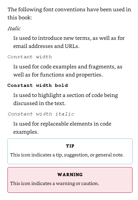
用户指南通常在前言中放置一个关于高亮字体、颜色和排版含义的图表:
我很感激你对本章的想法、反应和批评: 你的回应.
