Please click here to help David McMurrey pay for web hosting:
Donate any small amount you can !
Online Technical Writing will remain free.
A user guide is essentially a book-length document containing instructions on installing, using, or troubleshooting a hardware or software product. A user guide can be very brief—for example, only 10 or 20 pages or it can be a full-length book of 200 pages or more. While this definition assumes computers, a user guide can provide operating instructions on practically anything—lawnmowers, microwave ovens, dishwashers, and so on.
The more complex the product, the greater the page count. When this happens, some elements of the user guide get split out into their own separate volumes—especially the installation procedures, troubleshooting procedures, and the commands. A user guide can even contain a brief tutorial—for example, getting users started using the product—but if there is too much tutorial, it too goes into a separate book.
 NotebookLM-generated infographic of this chapter
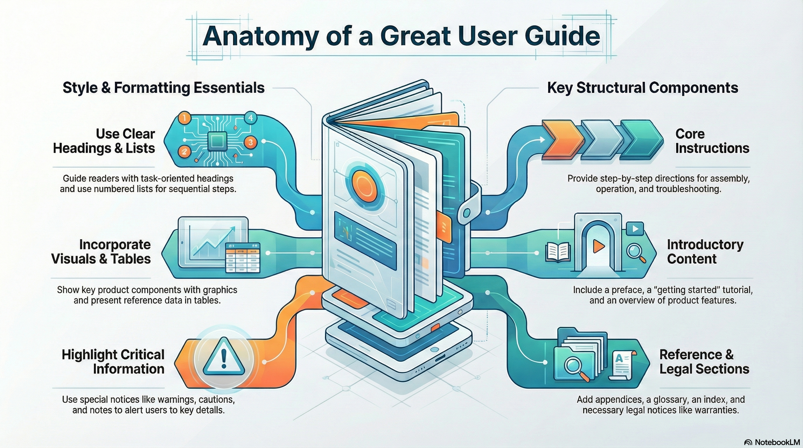
Style and Format for User Guides
A user guide is a combination of many things presented in this online textbook. At its core is instruction writing; you need to be good at the writing style, headings, lists, notices, highlighting, tables, graphics commonly used in instructions. (For an overview of these elements, see the page-design chapter in this online textbook.) As a set of instructions, a user guide should use the style and format that is presented elsewhere in this online textbook:
- Headings. Use headings to mark off key contents of the information so that readers can find it quickly. See the chapter on headings for details on planning and designing headings.
- Lists. Use numbered and bulleted lists to help readers scan information quickly. See the chapter on lists for details on planning and designing lists.
- Special notices. Use special notices such as warnings, cautions, and notes to alert readers to potential problems or emphasize special points. See the chapter on notices for details on planning and designing notices.
- Instructional design. In general, use the standard design of instructions; primarily, this means task-oriented headings and sections and numbered vertical lists for actual steps that readers are to perform. See the chapter on instructions for details on planning and designing instructions.
Instructions—and therefore user guides—also make abundant use of:
- Graphics. Show readers key components of the objects they will be working with, before and after views, and illustrations of key actions that readers must perform. See the chapter on graphics for details on planning and designing graphics.
- Tables. Provide statistical information and other such details in easy-to-access table form. In user guides, tables are particularly useful whenever reference-type information must be presented. See the chapter on tables for details on planning and designing tables.
- Highlighting. Use a consistent and standard scheme of highlighting (bold, italics, alternate fonts, color, caps, and so on). See the chapter on highlighting for details on planning and designing highlighting guidelines.
Components of User Guides
As a book, a user guide must have some combination of the standard book-design components such as the following:
- Front and back covers
- Title page
- Edition notice
- Trademarks
- Disclaimers
- Warranties
- License agreements
- Safety notices
- Preface
- Appendixes
- Glossary
- Index
- Reader-comment form
There is no standard combination or sequence of these elements; every company does it differently. Details on the contents, format, and design of these elements can be found in the book-design chapter.
Information Included in User Guides
Here's review the common contents of user guides:
- Instructions. The most obvious are those step-by-step directions on how to assemble, operate, or troubleshoot the product. Instructions in user guide should generally be task-oriented—that is, written for specific tasks that users must perform. Instructions should generally use vertical numbered lists for actions that must be performed in a required sequence. Similar or closely related instructions in user guides should be grouped into chapters.
- Precautionary information. You'll see notes, warning, caution, and even danger notices in user guides. These represent liability concerns for the manufacturer of the product.
- Reference information. User guides typically contain plenty of reference information, but only up to a certain point. For example, if there are numerous commands, a separate book for commands is necessary. Reference information in user guides is often presented in tables: columnar lists of settings, descriptions, variables, parameters, flags, and so on.
- Getting-started information. Some user guides will actually include brief tutorials that will help new users get acquainted with using the product.
- About the product. User guides also provide some description of the product, a review of its essential features or its new features. Sometimes this information also gets put into a separate volume, if it is extensive. Typically, the volume will be called something like "Introducing New Product...."
- Technical background. Sometimes, users guides will include technical explanations of how the product works, what physical or chemical principles are essential to its operation, and so on. For example, you will see considerable background in user guides for graphic or audio programs—you can't operate them without understanding the concepts of brightness, saturation, and hue; μ law, A law, and other such.
Descriptive Examples of User Guides
Consider these examples.
Note: Not all of the following styles and formats are not necessarily recommended. Get in touch using the e-mail address at the bottom of this page if you have questions.
Delarina WinFax LITE User's Guide. This book is 5.5 × 8.5 inches and under 150 pages. It uses by-chapter pagination, with new chapters and sections beginning on a righthand page.
- Covers: On the front cover, you see the full book title, a version number, the company name with its logo, and warning that the book is not for retail sale. The back cover contains advertising material—rather atypical for user guides—on the product's best features, special offers on the full version, a 1-800 number to call, and the book number.
- Title page: The first page inside this user guide is the title page, which includes the product name, the book title, the book edition number, the date of the edition, the company logo (which includes its name), several addresses for the company, and the not-for-retail-sale warning. The company name has a registered trademark symbol beside it; the product name has the trademark letters beside it. No trademark symbols are shown on the front or back covers. A greener approach is to omit the title page, since it is practically a duplicate of the front cover, and put the edition notice on the back of the front cover.
- Edition notice: On the back of the title page is the edition notice. This edition notice includes the book title, a copyright notice, legal statements concerning copying the book, list of trademarked product names occurring in the book, and the document number.
- License agreement: On the next page is the software agreement, a two-page thing that outlines permitted uses of the software and related warranties.
- Table of contents: The TOC begins on a right-hand page numbered "i" and lists up to level of headings within the chapters.
- Headers and footers: The book title is used for both the left and right footers: on the left page, the title is right-aligned; on the right page, the title is left-aligned. The page number appears opposite of both footers, and a solid ruled line is placed just above both footers. The chapter title is used for the inside header on each page; the current heading is used for the outside header on each page. A solid ruled line is placed just beneath these headers.
- Preface: The overview which is treated as chapter 1. It contains some promotion of the product, a diagram of the product's many uses, hardware and software requirements on its use, an overview of the manual contents, and instructions on how to get help.
- Body chapters: Chapters use the following design features:
- Chapter title—Large bold Arial letters with the chapter title on the left margin and the chapter number on the right and a double ruled line below.
- Headings—First-level headings are about 1 point smaller than chapter titles, left aligned, with a solid ruled line just below. Second-level headings are about 2 points smaller, left aligned, with no ruled line. Third-level headings are the same size as body text but use bold italic Arial and are placed on the left margin.
- Text—Body text is a serif font about 10 points in size. This manual does not use hanging-head format; run-over text extends to the same left margin as do headings.
- Graphics—Numerous screen captures are used through the book; they are all centered.
- Lists—Numbered lists are used for items in sequence such as steps. Open squares are used for bulleted items that have a subhead. Otherwise standard filled disks are used as bullets.
- Highlighting—Text that users must type uses a sans serif type (probably Arial) as do screen buttons, options, field names, and system messages. Bold is used for simple emphasis.
- Notices—Only notes and hints are used. The word "Note:" or "Hint" uses bold-italics. The text of the notice is regular body font indented an inch.
- Appendixes—The book ends with two appendixes: Appendix A addresses common problems with a situation–solution format; Appendix B addresses fonts. These pages are numbered A–1, A–2, . . . B–1, B–2, and so on.
- Index—The book ends with a 10-page index whose page are numbered with lowercase roman numerals starting at i. The index uses the standard but does something unusual with entries. It uses a table-of-contents format for the entries and their page references, connecting them with the sort of leader dots you'd see in TOCs.
IBM Aptiva Reference Guide. This book is also 8.5 × 5.5 inches. It is uses consecutive page numbering throughout the book and is about 120 pages long.
- Covers: The front cover has a graphic design with stylized numbered 1, 2, and 3 along with large grid pattern and various sorts of shading. The three elements of the book title are placed at the top, upper third and bottom of the area, respectively. You also see the words "information," "getting help," and "troubleshooting" which seems to float between the second and third title elements, giving readers a more detailed sense of the book's contents. The back cover continues the grid pattern and includes the IBM logo with the part number of the book, its print date, a statement that the book was printed in the "USA" and a bar code for the book number.
- Title page: This page contains the words "Aptiva Reference Guide" in large serif letter in the upper right of the page—and that's it!
- Edition notice: The edition notice occurs on the back of the title page. It is pushed to the bottom of the page and uses a smaller type size, probably 7-point, for its body text. The heading for the edition notice is the edition number followed by the month and year of the edition. The paragraphs of the edition notice states that the book is provided "as is" without any warranty, that the book is for multiple models of the product and that portions of it may not refer to the reader's own particular model. Also included are an address where comments can be sent, a 1-800 number to request additional copies, and the standard copyright line.
- Table of contents: The TOC is an unusual design in which all entries are left aligned in the center of the page, with the page numbers to the left about an inch. First-level entries use bold. TOC begins on page iii.
- Notices section: The first body section of this manual is for notices—specifically, trademarks, highlighting conventions used in the book, safety notices, and regulatory (communications) notices. The section begins with its own title page on which is displayed the word "Notices" in a large serif font in the upper right corner and with a grid and shading design similar to that on the front cover. The text of the notices section begins on a right-hand page as does the chapter title page.
- Body text: Here are the key design features of the body text:
- Text—Text for this book is indented nearly 2 inches. Body text is a rather small sans serif font, probably Helvetica, probably 9 or 10 points. The hanging-head format is used.
- Headings—First-level headings align to to the far left margin, use a blocky bold sans serif font with a solid ruled line above. Chapter titles use a large gray serif font in the upper right corner of the first page of the chapter. Second-level heading align with body text, use sentence-style caps (as do first-level headings) and use the same font as do first-level headings but about 2 points smaller.
- Highlighting—In stepwise instructions, the following elements are bold: buttons, tabs, menu options, menu names, keyboard key names, icon names, parameter settings. Names of disks supplied with the product are in italics. System messages are in regular roman and double quotation marks.
- Steps—Instructions sequences are introduced with a gerund-phrased heading in the bold font. Substeps or alternate subtasks use infinitive phrasing with the same font but smaller and are punctuated with a colon. Actual steps use a number in the same smaller font without a period.
- Headers and footers: Only footers are used. Bold page numbers (using the same font as the first-level heading but much smaller) are on the outside; the current heading, not chapter title, is centered and in a serif italics font using sentence-style caps.
- Special notices: This book uses a light gray box with a white checkmark in it to call attention to special notices. The text of the special notices is the same as the footers: small italic serif font. Usually, the checkmark box is located on the far left margin and the notice text is aligned to the normal body text. Where possible, the checkmark box and the notice text are in the open area between the far left margin and the body text.
- Troubleshooting section: The body of this section begins with a flowchart that must be meant to orient a user to the overall process of troubleshooting and to the different troubleshooting resources available. The next section consists of common questions with actions to take depending on yes or no answers. The text of the actions is bulleted or numbered depending on the content and contains cross-references to other areas of the troubleshooting information. The next section is designed in two columns, the left column with the heading "If the problem is..." and the right column with the heading "Here's what to do..." The problem statement in the left column is in bold. the next section is similar except that it lists error codes that are displayed on the computer and actions to take.
- Index: The book has a 6-page index formatted in 3 column. Two levels of index entries are used. The page references are set about a half inch away from the text entries.
AI Prompts for User Guides
Checklists, which typically go unread, can be used as source for AI prompts with some modification. Copy the following, paste it into an AI system such as Google's Gemini, and see what you may have missed.
Note: All references to the content, format, style of techdocs or its components can be found in the online technical-writing textbook.
coming soon!
I would appreciate your thoughts, reactions, criticism regarding this chapter: your response—David McMurrey.
