Please click here to help David McMurrey pay for web hosting:
Donate any small amount you can
Online Technical Writing will remain free.
This page is under repair.
A user guide is a techdoc explaining how to perform common tasks by a user of a product. Common tasks are those actions that the user needs to be able to perform. The user is at a level of knowledge and experience intended by the product. Some products have basic users and advanced users—a user guide can fulfill one of those needs or both. Think of a microwave oven: it can have a basic user, and that's about it. On the other hand, a graphis design product can have both basic users and advanced users.
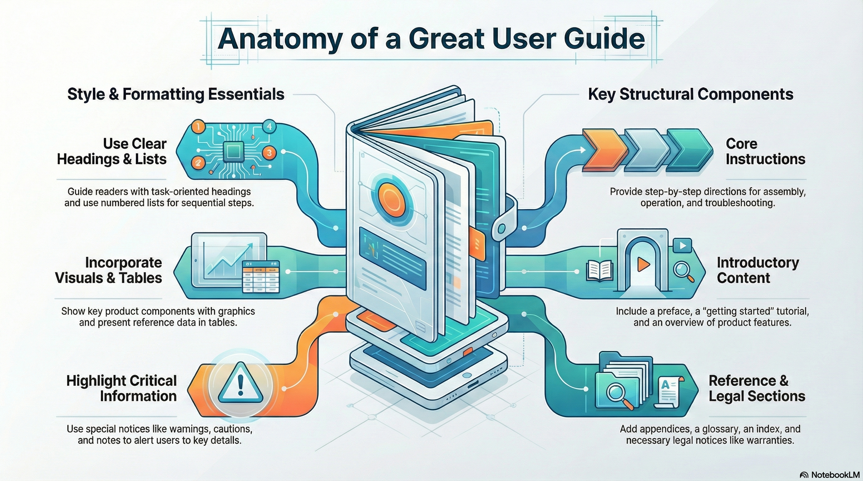 NotebookLLM-generated infographic of this chapter
In this chapter, book design means the content, style, format, design, and sequence of the various typical components of a book. "Components" here refers to actual sections or pages of a book such as the edition notice, the preface, the index, or the front or back cover. In the page-design chapter, the term element refers to things that can occur multiple times practically anywhere in a book, such as headers, footers, tables, illustrations, lists, notices, highlighting, and so on.
The following provides an overview of the typical components of a printed technical book and the typical content, format, style, and sequence of those components. Certainly, no single user guide, technical reference manual, quick-reference document, or other such document would actually have all of these components designed and sequenced in precisely the way you are about to read. Instead, this review will give an overview of the possibilities—let's say the range of possibilities.
Note: Currently, we have only example user guide developed in FrameMaker then output to PDF. It lacks a glossary, but all other pieces of a typical user guide are in place. (I can't figure out that "d" in "Filepad"!) Be aware that it does not use some of font and margin requirements listed below.
Before you begin reading the following, grab a number of hardware and software books so that you can compare their content, style, format, and sequencing to what is discussed here.
For even more detail than you see here, consult these two standard industry resources:
- Sun Technical Pubs. Read Me First! Any recent edition. Prentice Hall.
- Microsoft Corporation. Microsoft Manual of Style for Technical Publications. Any recent edition. Microsoft Press.
You can see examples of these book components in Techdoc Design.
Front and back covers
Product documents for paying customers usually have nicely designed front covers even if, on the inside, the book is bargain basement in terms of its quality. On the front cover, you will typically see some or all of the following:
- Company name
- Product name
- Product platform or operating system
- Product version and release numbers
- Book title
- Company or product logos
- Trademark symbols
- Artwork
- Book order number
- Company or product slogan
It can be challenging to figure out a good format for the company name, product name, and book title. Sometimes, these can amount to a whole paragraph of text! Companies are quite divided on whether to indicate version and release numbers on front covers—some do; some don't. Almost always, however, you'll see the platform indicated—whether the product is for the Macintosh, the PC, UNIX, and so on.
Example of a cover page.
The back cover of hardcopy user guides and manuals is usually very simple. Typically, it contains the book order number, the name of the company with appropriate trademark symbols, a copyright symbol and phrasing as to the ownership of the book, and a statement as to which country the book was printed in. You'll also find bar codes on the back cover. See if your software can generate a bar code—you just access the bar code utility and type in the book order number, and the utility generates the bar code.
Title page
The title page is typically a duplicate of the front cover, but with certain elements omitted. Typically omitted are the artwork, company or product logos, and slogans. Some technical publications omit the title page altogether because of the seemingly needless duplication. (And in a print run of 20,000 copies, a single page means a lot!)
Example of a title page.
Edition notice
The edition notice is typically the first instance of regular text in a technical publication, although it is typically in smaller type. It occurs on the backside of the title page. If the technical publisher is taking the lean-and-green approach and eliminating the title page, the edition notice will appear on the backside of the front cover.
No one likes to read fine print, but take a look at the statements typically included in an edition notice:

Example of an dition notice
Trademarks
Whether you list trademarks and how you listen is the province of company attorneys. In any case, you list only those trademarked product names that occur in that particular user guide.
Most commonly, trademarks are indicated:
- in the edition notice (as the illustration above shows)
- in a separate section somewhere in the user guide
mention that note
If corporate attorneys want every occurence of a trademarked product name indicated with an asterisk or footnote, try to talk them out of that page design fiasco. Littering text with asterisks or footnote numerals is distracting for readers.
Warranties
Warranties accompany physical hardware products—not software. Corporate attorneys take responsibility for warranty language and format. If you are creating an exampleuserv guide or book for your portfolio, you can use this anonymous "warranty example"popup to show that you are aware that warranties must be included.
software warranties?Safety notices
Hardware products typically have a section of safety notices at the front of their books. These may occur as a subsection of the preface, for example, or as a separate section in their own right. These sections typically bring together all of the danger, warning, and caution notices that occur throughout the book and arrange them in some sort of logical way. But even with this up-front alert, hardware books still place the individual notices at the points where they apply. (For more information, see special notices.)
Communication statements
Hardware books also require communications statements as stipulated by the governments of the countries to which these products are shipped. In the U.S., the FCC requires certain communications statements depending on the "class" of the hardware product. As a writer, you must be careful to use the right communication statement for the product you are documenting—and not to edit the statement in any way (holy legal words!).
Table of contents
The table of contents (TOC) usually contains at least a second level of detail (the head 1s in the actual text) so that readers can find what they need more precisely. Writers, editors, and book designers typically argue about the sequencing of the TOC. In terms of usability, it's much better to have the TOC as close to the front of the book as possible, if not at the very first of the book. In terms of legalities, however, people worry that all those communication statements, warranties, copyrights, trademarks, and safety notices should come first. In those places where usability wins out, books use every tactic they can to get this legalistic material out of the front matter: warranties are put on separate cards and shrink-wrapped with the book or product; warranties, communication statements, trademarks and other such may be dumped in appendixes.
Trouble creating a nicely formatted TOC? See Create a professional-looking TOC
List of figures
Technical manuals for ordinary users typically don't have lists of figures. In fact, the figures themselves typically do not have full-blown figure titles. But this isn't to say that a list of figures has no place in technical manuals. It all depends on the reader and the reader's needs—and the content of the book as well. If the book contains tables, illustrations, charts, graphs, and other such that readers will want to find directly, the figure list is order.
Preface
The function of the preface is to get readers ready to read the book. It does so by:
- characterizing the content and purpose of the book
- identifying or even briefly describing the product the book supports
- explaining the type of reader for whom the book is meant
- outlining the main contents of the book
- showing any special conventions or terminology used in the book
- providing support and marketing numbers, and other such
In traditional book publishing, the preface comes before the table of contents; but as discussed previously in the table of contents section, technical publishing people want the TOC to come earlier in the book for usability reasons.
Body chapters
Oh yes, and there is actual text in these books—it isn't all front matter! Little else to say here other than most technical books have chapters or sections, and, in some cases, parts. See the chapter on page design for format, style, and design issues for elements such as headers, footers, headings, lists, notices, tables, graphics, cross-references, and highlighting.
Appendixes
As you know, appendixes are for material that just doesn't seem to fit in the main part of a book but can't be left out of the book either. Appendixes are often the place for big unwieldy tables. Some technical publications have things like warranties in the appendixes. In terms of format, an appendix is just like a chapter—except that it is named "Appendix A" or some such, and the headers and footers match that different numbering and naming convention (A-1, A-2, and so on for pages in Appendix A).
Glossary
Some technical publications include a section of specialized terms and their definitions. Notice that most glossaries use a two-column layout. Typically the each term and its definition make up a separate paragraph, with the term lowercased (unless it is a proper name) and in bold, followed by a period, then the definition in regular roman. Notice too that definitions are typically not complete sentences. Good glossary definitions should use the formal-sentence definition technique as described in the definition chapter of this online text. Multiple definitions are typically identified by arabic numbers in parentheses. Glossary paragraphs also contain See references to preferred terms and See also references to related terms.
Index
Indexes are also typically two-column and also contain See references to preferred terms and See also references to related terms. See the chapter on indexing for processes and guidelines for creating good indexes.
Reader-response form
Before the rise of the Internet and social media, some technical publications contained a hardcopy form to enable readers to send in comments, questions, and evaluation of the book. Of course, it turns out that these forms more often elicit complaints about faulty function in the product that the book documents. With the rise of the Internet, these forms have gone online, and books merely point to their location online.
Book design and layout
Typically, user guides and manuals produced by hardware and software manufacturers are designed in a rather austere and spartan way. High-tech companies develop new versions and releases of their product sometimes every nine months. In this context, sophisticated design is just not practical. Here are some of the typical layout and design features you'll see:
- Page size is often determined by packaging considerations as well as by standard page sizes available with printing companies. When page size is not a constraint, some companies will use the 8.5 × 11-inch page size—this makes production much easier for writers.
- Pages are typically designed with alternating right and left pages. The footer for the left (even) page starts with the page number and ends with the title of the book. The footer for the right (odd) page starts with the title of the chapter and ends with the page number.
- Practice is mixed on whether page numbering is consecutive throughout the book or by-chapter.
- Unless pages are rather small, the hanging-head design of headings in relation to pages is quite common in technical manuals. The hanging indent is usually one inch to one-and-a-half inches.
- Fonts are often 12-point Times New Roman for body text and Arial for headings. Standard line spacing and word spacing are used. See the chapter on highlighting for other typographical issues.
- Margins are fairly standard, one to two inches all the way around. Typically, an extra half-inch is used on inside margins to allow for binding.
- Typically, color is not used in these manuals and guides, usually out of cost and efficiency considerations.
Preface
User Guide Main Chapters
Appendixes
Index
Other User Guide Elements
Headings
Bulleted and Numbered Lists
Symbols, Numbers, and Abbreviations
Graphics and Figure Titles
Cross-References
Page Numbering
AI Prompts for User Guides
Checklists, which typically go unread, can be used as source for AI prompts with some modification. Copy the following, paste it into an AI system such as Google's Gemini, and see what you may have missed.
Note: All references to the content, format, style of user guides or their components can be found in the online technical-writing textbook.
When you want to use AI to evaluate a writing project, introduce yourself, tell AI who you are, what you want. Give AI a reference point for doing evaluations like an online textbook. Then post what you want AI to check in its evaluation.
Modify the introduction to fit your identity.
|
AI Prompts User Guides Hello, AI. I am requesting that you evaluate instructions written by a U.S. college sophomore. Below is a summary of textbook chapters on instructions and notices to use as the basis of your evaluation. (Identifying information masked):
|
Related Information
Reading quiz. Use this quiz to test your understanding of this chapter.
How to Write User Friendly Help Topics for Beginners. clickhelp.com
How to write user documentation. techscribe
User guides. techscribe
I would appreciate your thoughts, reactions, criticism regarding this chapter: your response—David McMurrey.
